
Most viewed logos · Page 536

Inversiones Inmobiliarias

 0Oct-21-15


Logo criado para promoção Maxi Loucos por Choco para Bauducco.
 0Jan-14-11
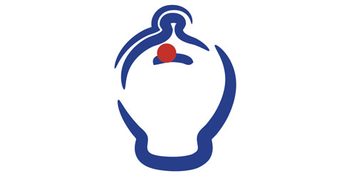
It's for a Spanish clone of mint.com called ahorroy.com. The logo represents the text of the mark "ahorro y punto", "ahorro" means "I save" and "y punto" is a Spanish expression meaning "end of history", and literally means "and point". So the logo is a piggy bank and a point. I applied dynamic strokes to represent innovation of the application. At the same time, simulates to be a face looking up and sticking out his tongue.
 0Aug-23-14
Beauty center & solarium logo.
 0Apr-19-12
A logo for a great 1st AD.
 0Jan-17-11

it was observed that the abbreviation of the words "Bureau of Information Technology" reads as "BIT", that's why I used 1 and 0 of which was built logo and it's variations http://habrastorage.org/storage1/57b2d3a9/44dd4bc0/ab5a4ddd/a2d42032.png
 0Sep-06-11

 0Dec-07-10
Black cat is small design outsource company Providing Services related to design media where we achieved our goal as designers with lots of various designs and our core value to provide high quality design as per client satisfaction. Here my web: www.blackcatvn.com
 0Jan-16-14
 0Dec-06-10

logo fofr Stopp- motocycle brake discs to motorcycle dealers and motorcycle riders seller
 0Oct-31-11
For fun...
 0Dec-19-10

e-commerce theming and application design company
 0Dec-13-10
 0Dec-06-10
 0Dec-07-10

Logo for a travel agency . Can be modified as per name
 0Jul-08-14

Personal logo
 0Apr-02-16

Logo design done for kitchen cabinets shop based in Chicago, IL.
 0Mar-25-12

SumoMania logo for Sumo Suit hiring company in Adelaide, South Australia by DivParty
 0Sep-25-12

 0Dec-06-10

moving company
 0Sep-01-11
 0Dec-14-10
Logo for a poker related site http://fluxstables.com/ The banners are my designs as well.
 0Sep-05-11

Corporate Design for an art and design gallery that was open 2 hours a day, for 24 days.
 0Jan-07-15

A logo created for a mobile cycle repair company.
 0Oct-14-15