https://www.behance.net/gallery/40556041/Interespacio-
INTERESPACIO: based on the characters of (I)nterior and (E)spacio + celosia. The study came from Mexico. Three years ago, as first instance began with interior design and architecture, then we got and started working professionally. Throughout the time we moved to Argentina and the idea of opening our own trade and professional studio. We needed a nice, comfortable place for people to know us a little more and we could show our knowledge in: products and services
0Sep-17-16
This is logo for newest HTML template.
0Sep-30-13
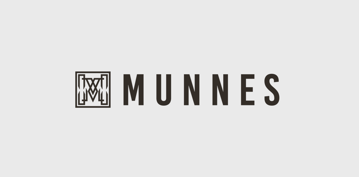
Munnes logo
In order to highlight the quality, style and distinctive character of the Munne glasses, we have developed a logo that reflects all of this. He chose a stylish combination of an icon and a name. Using graphic details, we have created a unique and exclusive design of the character - the letter "M". The square contains a hollow letter, which consists of various graphic details and shapes. This style looks like a non-banal, unobtrusive, and eye-catching one. To keep pace with classics and aesthetics, we selected a combination of two colors, a white-and-white. It helps maintain the image of a neat, modern logo. We branded the brand next to the symbol. We chose the color of this dark brown, color. The brighter and "heavier" name of the brand has become like a counterweight, a dimmer symbol, while preserving the integrity of the style.