
Most viewed logos · Page 522

Mountain Mark logo.

 0Jul-21-11


CLOSE INFORMATION
 0Aug-17-11


Stylized "W" in flame. Its a creative logo for wide range of business and many categories. It can be used for sport, fashion, as trademark for any companies and brands.
 0Jul-26-13

WEB AGENCY
 0Jul-01-11

Identity creation for Metro U.S. Design Department
 0Mar-12-11

A logo I designed for an indie rock band called the Torn Speakers.
 0Apr-15-13

Logo design for Disco Bar
 0Nov-03-11

Logo for network group
 2Aug-04-11

A logo I made for one of my friends and her graphic design team
 0Jan-23-15

Community Church in Birmingham, AL
 0May-04-11

“A. K. POWER INDUSTRIES PVT. LTD” is a well-known name in the world of power line. We are the pioneer in the field of manufacturing & exporting of transmission, distribution & substation line materials, Transmission & Telecommunication towers, Heavy engineering products/items, Solar power modular structures & accessories.
 0Oct-12-12

logo for a garnening service company named "elfo"
 0Feb-03-11
Logo for "duga-p", fast food. "duga" means RAINBOW, "P" is... well something that makes things more complicated for me :)
 0Dec-19-10

this was made for a construction company
 0Sep-09-14

 0Aug-19-24
 0Dec-06-10

 0Mar-05-26

La Maison de Tante Agathe (Aunt Agatha's House) is a french brand that specializes in culinary products and premium tableware. Located in Paris and Nantes, the brand also has a strong online presence through various websites. Brand Brothers worked with the brand and its company since the beginning. We created for them a premium brand image through a global branding, based on authenticity, good taste and quality.
 0Jun-07-11
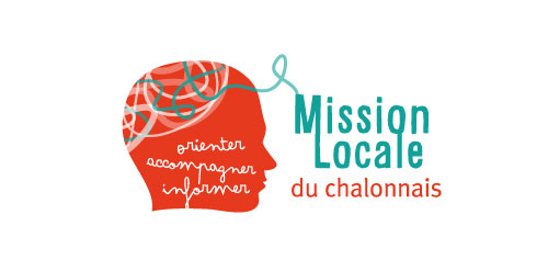
Idée générale Les jeunes vont à la Mission Locale parce qu'ils ont besoin d'aide, besoin de parler, d'être entendu, besoin de renseignements, de conseils… Les idées sont multiples chez les jeunes, mais souvent trop floues. La Mission Locale est là pour aider à faire le tri et faire ressortir les meilleures idées auxquelles elle trouve les meilleures solutions (information, emploi, formation, aides…). - La forme orange est la silhouette d'un visage dessiné, non réaliste, pour que tout le monde puisse s'identifier, se projetter à travers ce logo. Par ailleur, se sont les jeunes qui créent la Mission Locale, par leur passage. Cette silhouette rend le logo très humain car il y a une dimension sociale derrière cette structure. Cette forme ce termine par une pointe sur la gauche qui pourrait s'apparenter à une bulle de dialogue puisque l'intéraction entre la Milo et les jeunes est basé sur l'échange. - Le méli-mélo représente les idées, les projets de chacun qui sont emmêlés dans l'esprit du jeune, la Mission Locale l'aide à faire le meilleur choix. Avec ce trait nous retrouvons la notion de liens, de soutien, d'accompagnement mais aussi de chemin, de parcours, de voix… Typo . Alsina (regular) . Metaplus (medium) . Arsenal White (regular) Une typo forte originale, entre linéale et manuscrit, sérieux et brouillon, pro et jeunes, entre l'emploi et le social. Toujours la typo Metaplus sobre et stylisé pour équilibrer le tout. Le slogan se compose de trois mots reprenant les objectifs de la Mission Locale : ''orienter, accompagner et informer''. Le message est clair, net et précis mais aussi lisible rapidement. L'écriture est manuscrite presque enfantine, pas régulière pour mettre en confiance les jeunes : tout le monde, avec ses qualités, ses défauts, son parcours, ses origines… peut venir à la Milo. Parler d'orientation n'est pas une honte, au contraire ! Couleur . Bleu Vert (cyan 80 / Magenta 10 / Jaune 45) . Orange Rouge (cyan 8 / Magenta 93 / Jaune 95 / Noir 1) Un rouge orangé très chaud qui montre la vitalité, la jeunesse, l'effervescence des idées et projets et un bleu vert pour adoucir, apaiser, solutionner.
 0Apr-04-11

Logo for game
 0May-07-12

Importers of all kinds of accessories and laptop computer and iPad and authorized distributors for all brands ..
 0Dec-18-14

A concept logo for a DIY web design site where users could select from a pre-assortment of designs/layouts to start off their site with. Of the designs presented, this concept proved to be the most visually dynamic and fun.
 0Mar-07-11

 0Jan-22-25

It's The Eye Catching Up Creative Works! Grafizine site/blog to share creative and inspirational designs include graphic design, motion graphic design, photography also to share inspirational and instructive tutorials about creative design works.
 0Jan-14-11