Most viewed logos – Page 521

laevsky design - rabbit


solergo

Logo design Project

Touristic promotion of Insubria (some provinces of north Italy and south Swiss).
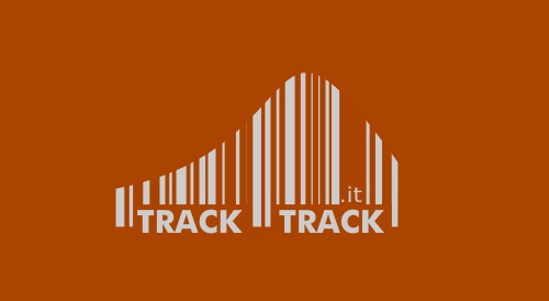
Logo proposal for tracktrack.it. a company that embeds a tracking code on mp3s so that musicians can track their music. Similar work can be viewed at www.designsourced.com. Thanks for looking!

Logo design For GrafixEra
GrafixEra is the Online Magazine Of Creative artworks
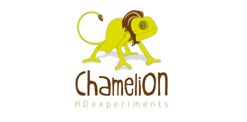
Chamelion- HD Experiments
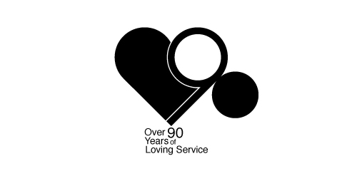
90 anniversary design for local business

THIS LOGOTYPE IS FOR REAL ESTATE
image: After hours of work stress tired mind the crowd in general, everyone should be relaxed to rest, leisure watch their favorite programs on TV.With particular characteristics is produced entertainment television programs, that is why I took the picture relaxing seat to the icon for the logo.Chair stylized with soft curved lines, soft and full of life. colors: To create excitement for the viewer, as well as emphasizing the characteristics of the program logo should be used warm colors red orange, to attract attention attractive visual look and this color is the color of powervolume,


Clinica Veterinaria · Italia

K-T-O

A simple, minimalistic logo I created to expand my portfolio.

Acoustic guitar duo

Logo for an event organiser who required a lightweight and simple design. Neon green and blue colours were applied, and toned down to create a calming visual.

for denttist

Estudio de Dibujo y Pintura

Logo produced for a range of gift sets containing Rough Guides travel books and Earworms language DVD's.

Logo Proposal
Idée générale Les jeunes vont à la Mission Locale parce qu'ils ont besoin d'aide, besoin de parler, d'être entendu, besoin de renseignements, de conseils… Les idées sont multiples chez les jeunes, mais souvent trop floues. La Mission Locale est là pour aider à faire le tri et faire ressortir les meilleures idées auxquelles elle trouve les meilleures solutions (information, emploi, formation, aides…). - La forme orange est la silhouette d'un visage dessiné, non réaliste, pour que tout le monde puisse s'identifier, se projetter à travers ce logo. Par ailleur, se sont les jeunes qui créent la Mission Locale, par leur passage. Cette silhouette rend le logo très humain car il y a une dimension sociale derrière cette structure. Cette forme ce termine par une pointe sur la gauche qui pourrait s'apparenter à une bulle de dialogue puisque l'intéraction entre la Milo et les jeunes est basé sur l'échange. - Le méli-mélo représente les idées, les projets de chacun qui sont emmêlés dans l'esprit du jeune, la Mission Locale l'aide à faire le meilleur choix. Avec ce trait nous retrouvons la notion de liens, de soutien, d'accompagnement mais aussi de chemin, de parcours, de voix… Typo . Alsina (regular) . Metaplus (medium) . Arsenal White (regular) Une typo forte originale, entre linéale et manuscrit, sérieux et brouillon, pro et jeunes, entre l'emploi et le social. Toujours la typo Metaplus sobre et stylisé pour équilibrer le tout. Le slogan se compose de trois mots reprenant les objectifs de la Mission Locale : ''orienter, accompagner et informer''. Le message est clair, net et précis mais aussi lisible rapidement. L'écriture est manuscrite presque enfantine, pas régulière pour mettre en confiance les jeunes : tout le monde, avec ses qualités, ses défauts, son parcours, ses origines… peut venir à la Milo. Parler d'orientation n'est pas une honte, au contraire ! Couleur . Bleu Vert (cyan 80 / Magenta 10 / Jaune 45) . Orange Rouge (cyan 8 / Magenta 93 / Jaune 95 / Noir 1) Un rouge orangé très chaud qui montre la vitalité, la jeunesse, l'effervescence des idées et projets et un bleu vert pour adoucir, apaiser, solutionner.