Most viewed logos – Page 520
Idée générale La mission Locale est un répère pour les jeunes, un lieu géographique, mais surtout un lieu d'écoute et de soutien. Elle informe les jeunes, les oriente et les accompagne dans leurs démarches. C'est un endroit où l'on va se confier, écrire son projet, monter un dossier et, au mieux, concrêtiser un rêve. C'est le rôle de l'avion en papier. - Le papier rapelle le projet, le côté administratif, le dossier, la recherche. - L'utilisation de l'origamie symbolise la construction (de projet, de soi). Il est dirigé vers un avenir positif. - Un fil relie la mission locale au projet, il représente la solidarité, le lien, la dimension sociale, le chemin, le parcours, l'accompagnement. Ce jeune est passé par la mission locale… Typo . Cooper (black) . Metaplus (medium) . NothingYouCouldSay (regular) Une typo forte et présente pour attirer l'oeil sur le nom "Mission Locale". Ses formes rondes et modernes sont attractives et rassurantes. "Du Chalonnais" est trop grand, je l'ai donc écris avec une typo plus fine pour équilibrer le tout. L'intitulé est justifié à gauche pour s'appuyer et soutenir, c'est une structure stable, sur qui l'on peut compter. Le slogan, lui, sort du côté sérieux, c'est une typo manuscrite, familière, plus humaine qui donne confiance au jeune : ce sont vos projets qui prennent leur envol. Couleur . Violet (cyan 76 / Magenta 100 / J 59 / N 61) . Orange (Magenta 76 / Jaune 100) Un violet profond, chaud, pour la structure mission locale et orange, lumineux, pour un côté dynamique sur le chalonnais et de plus en plus légé pour le slogan qui s'envole.


Logo for a website that sells funny things...


A school sports reporting website that branches into educational content. Logo concept is based on the underground subway idea of highlighting routes and information as a way of showcasing order for a website with a multitude of data.
Contractors
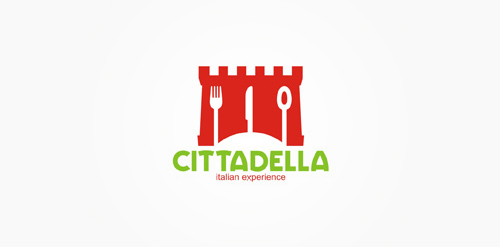
restaurant with Italian cuisinie

Logo for poker site
image: After hours of work stress tired mind the crowd in general, everyone should be relaxed to rest, leisure watch their favorite programs on TV.With particular characteristics is produced entertainment television programs, that is why I took the picture relaxing seat to the icon for the logo.Chair stylized with soft curved lines, soft and full of life. colors: To create excitement for the viewer, as well as emphasizing the characteristics of the program logo should be used warm colors red orange, to attract attention attractive visual look and this color is the color of powervolume,

Logotype design for M.O.S compilation cd. Design by Vasilis Magoulas / VAMADESIGN.COM

logo for helmethelp.com

This is a logo i've created for a company that deliver gifts in special boxes full of susprises and cool stuff!

Artistica logo was designed as logo concept for educational organisations. It is more like an emblem which makes is suitable for the purpose. This logo is available for download at http://freelogosdownload.com/free-free-education-logos-download-download

This was created for a series of audio and video workshops for children and teenagers.

Constructora e Inmobiliaria

logo for entertainment company

A logo I designed for an indie rock band called the Torn Speakers.


Identidade - Contexto & Filippo Ferrantelli