Most viewed logos – Page 516

Creative logo that illustrates the product branding.


swann,creative logo,logo,intevtive,best


Bleeker Events Logo
Logo for Bank.


Kayak Capers watersports logo

An e cigarette product (electric cigarette). Prototype for a brand that never launched. © Sassy Bee Design Studio
curvacious logo for swiss gardener

Advertising
Online wines seller.
This Dutch foundation aims to help AIDS orphans in Namibia. The logo one figure reaching another. The colors reflect the two nationalities (Dutch and Namibian). Typography is kept in the same look and feel as the logo, friendly and aiming to help out the children.

Logo designed for Stock market research company in India

Sam Bernard

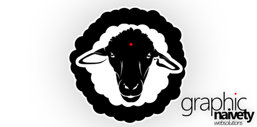
Because the sheep's for me the most naive "thing" on earth... I think graphicNAIVETY is proudly represented in this one !

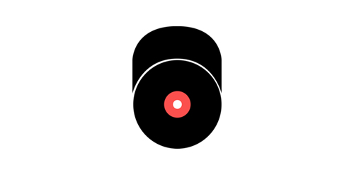
This is a logo of a person. He loves dancing (cap from the top), and music (vinyl).

Logo design for Gay2z, 2010.

521 tasarım

webcaret - add your logic
Javi, food from the sea.
