Most viewed logos – Page 512

A simple logo design.


MAN-LOCK is the figure wearing red button. The main idea is the figure MAN-LOCK save your valuables in the car, and the red button saying STOP steeling. This logo is made for mobile safe into the car.

Logo for bar

Rebranding of graphic, print, web studio. The house represents the "inhouse" aspect - we are a full service "Inhouse" art dept for companies. A rocket to represent an upward propulsion of endless creativity (we uploaded incorrect one before)


Logo header for the site that will be up shortly. Feedback and suggestions welcome and appreciated!

Well Pickled Brand by designdough

Dev Bens, rabbit, traprty

furnace oil manufacturing company

Spotless is a company dedicated to providing expertise for domestic house cleaning staff. Its logo consists of a drop of water that represents the purity in each of its services, is composed of three similar forms used in different sizes and positions each different color used in the same color range, handles overlap in your typography to generate a solid structure in its composition.

Wordmark using the wheel and fire to highlight the innovation part of "Humanovation"

Logo for Three Apples High Etsy store.

Photography
Logo for american football team from Russia (Khabarovsk).

Sunny Side up
Working on a whole new site and re-branding for White Studio a motion/graphic design company.

This is my first job :|
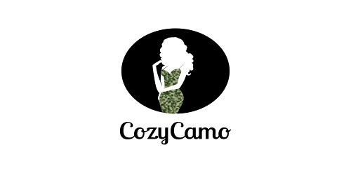
Clean design featuring a model wearing a camo dress

Spot-bar, billiard club

Design by Jose Ledezma - Venezuela
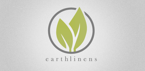
Earthlinens.com is currently undergoing a complete re-design. This will be their new logo. They sell high-end organic linens.

Logo for a Illusion company which creates Illusions through Printing.