Most viewed logos – Page 511
In rebranding my own small vending business I wanted to achieve a clean swiss-style design. I would appreciate any feedback. I used guides extensively but ultimately the character spacing came down to eyeball.


Unlock Your Creative Potential
We develop web sites and smart media.


Agenda Spectacle's website is one of the best french online booking sites for theater and arts.
Logo Design for Pinto Law Group

mark

Newest revision of my design companies logo.
Logo for my new portfolio www.drfrankendesign.de
It's my first logo ever - I'm a graphic design student from germany.

Simple design for animal and art related companies.
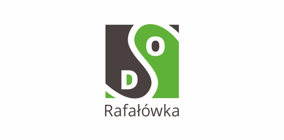
Logo for the gardens association - SOD RAFALOWKA
This logo represents the water colors on a swimming pool, the shapes also want to translate the waves and the different formats of the swimming pool .

Logo header for the site that will be up shortly. Feedback and suggestions welcome and appreciated!

Logo for an Ink Company

Web Graphics, Designs, Inspirations, Resources, Wallpapers, Photography, Freebies and more

This is the final logo chosen by the client. the lines represent the connection that people make to memorial hall and how the memorial will always be part of the neighborhood.

Logo for Click Print Hand

.

Logo for a golf club


This is a logo for a Dutch data management specialist, who will act like a radar to solve problems. They start from the core and provides solutions in the maze of data traffic. This is actually a labyrinth, which has only one route. He must ensure that it remains simple. Like a labyrith. And yes, he is certified too :-)

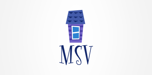
Rebranding of graphic, print, web studio. The house represents the "inhouse" aspect - we are a full service "Inhouse" art dept for companies. A rocket to represent an upward propulsion of endless creativity (we uploaded incorrect one before)