Most viewed logos – Page 500

Graphic & Web Design mountains


this logo is for fish packages and these fishes are giving of between mountain, s rivers.

Joke2 ,, is comics channel

Library Logo
Logo for a person who is a graduate of environmental science.

Logo for a cafe in rural Wyoming.

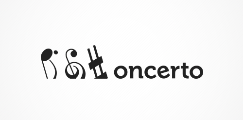
The concept is: subtraction. The name was created by leaving off the first letter of "concerto". So doing the same in the visuals was an obvious choice.

Expert Audit | Business audition

Generation. An abstraction of the word generation. Swirly, lace like logo type writing. Use it on any project you may wish. Under Creative Commons Attribution. Hope you like it. http://www.logoopenstock.com/1080-Generation-vector

tutoring young children in need

"DELAY is all about keeping you updated on everything that happens in the music industry without taking away our references. A music and events producer that exceeds the limits of stereotypes. Here is your meeting with DELAY. After all, everything that involves music deserves an echo, an effect, a little extra time of reproduction. For the design of this brand we aimed to work in a way that it would represent several different applications in different situations like rock, indie or pop. The brand would change according to what would be released, to adecquate itself to the kind of information it should bring.”

Designed by www.logodesigncreation.com

TL logo/ambigram

Michel Amberg

"The project was developed for a restaurant and pizza place, which is very common in Brazil. The brand and the material has a vintage feel to it, due to the architectural aspect of the place.”


Logo for graffiti company and mural decoration

Logo design for a Zenit goalkeeper

Homemade Chocolates

The logo is a clever coming together of the idea of "the eyes are the window to your soul" and the universally recognisable symbol for "sharing" content through social media networks which is the "soul" of what the company provides.
Draft design
Logo for a tractor dealer.

Magic words fits for any educational project, can also be used for bookstores, library or other. Under Creative Commons 3.0 Attribution Non-Commercial. http://www.logoopenstock.com/971-Magic-Letters-vector