Most viewed logos – Page 496
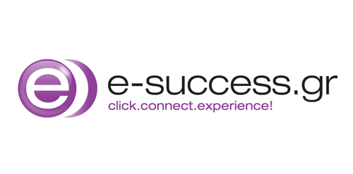
E-success is a company based in Athens, Greece that manages e-shops. The logo is friendly, eye-catching and connotes trust and high end technology. A vivid purple color was used to achieve memorability.


InovBe - computer security software

Logo of my app that i develop at the time.

A light logo design

Bikers Hood
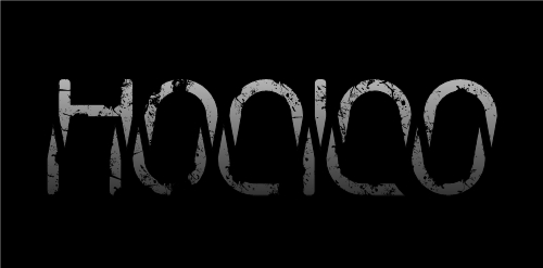
Description: hocico means mouth. Hocico it´s an industrial band from México. The type represents fangs, so that way you should see a big mouth!

Re-branding of Sharptech Web and Creative services with new Logo and Name (Interactive Waves)

Logo design for "A French Touch Salon", 2010.
New logo for digital design studio Doublethink, based in Glasgow, Scotland.

Women's Spring Festival
A concept made for a company which installs solar panels.

tu bywam / here i go Logo for the culinary and food service portal. One of the three proposals. The idea of the portal is the ability to select on the map places to visit and eat, drink and spend time. / 2010


Logo for a event for catering networking

Volari, a new smartphone communications service for international travellers. Volari is a play on “Volare” which is Italian for flight or soar.

Web development company based in Brighton, UK. The Client want to show that they're not afraid of controversy and are a creative bunch of folks. You can visit the logo on this site: http://www.camelpunch.com/

Logo design by http://www.dannyglix.com/logosandbranding.htm

Logo made for Digital Project Manager Anthony Guennegou, who were seeking for a retro look & feel. The logo is based on a combination of "a" & "g" letter.

An initial logo that can be used for any types of businesses.

free work.

logo for American Control systems

Issue desk, management system