Most viewed logos – Page 476

A logo design for account management program


CHAINZ is a logo that symbolizes Chain.

. the company is located in hyderabad. it is a multi cab service company . mainly focused on M&C, car. as per client inputs . the logo represent the trade of the company, in combination of M&C it looks like a car

Personal Logo Rebranding Letter (A+Ş) Details: https://www.behance.net/gallery/Personal-Logo-Rebranding/14077927
This logo was created as a personal brand mark for Geoff, to represent him as a graphic artist. This typographical solution was inspired by the 17th century Romaine du Roi, which features a serif face with its underlying structure. This mark was used previous to the Geoff Matheson Studio "G splat" and is no longer in use.

Logo for property investment company - specialising in holiday homes and rentals.

The word Zimzala is a surfing term, meaning "one who likes to keep their feet in the sand". We used a wave as a symbol for this marketing company's easy going style.
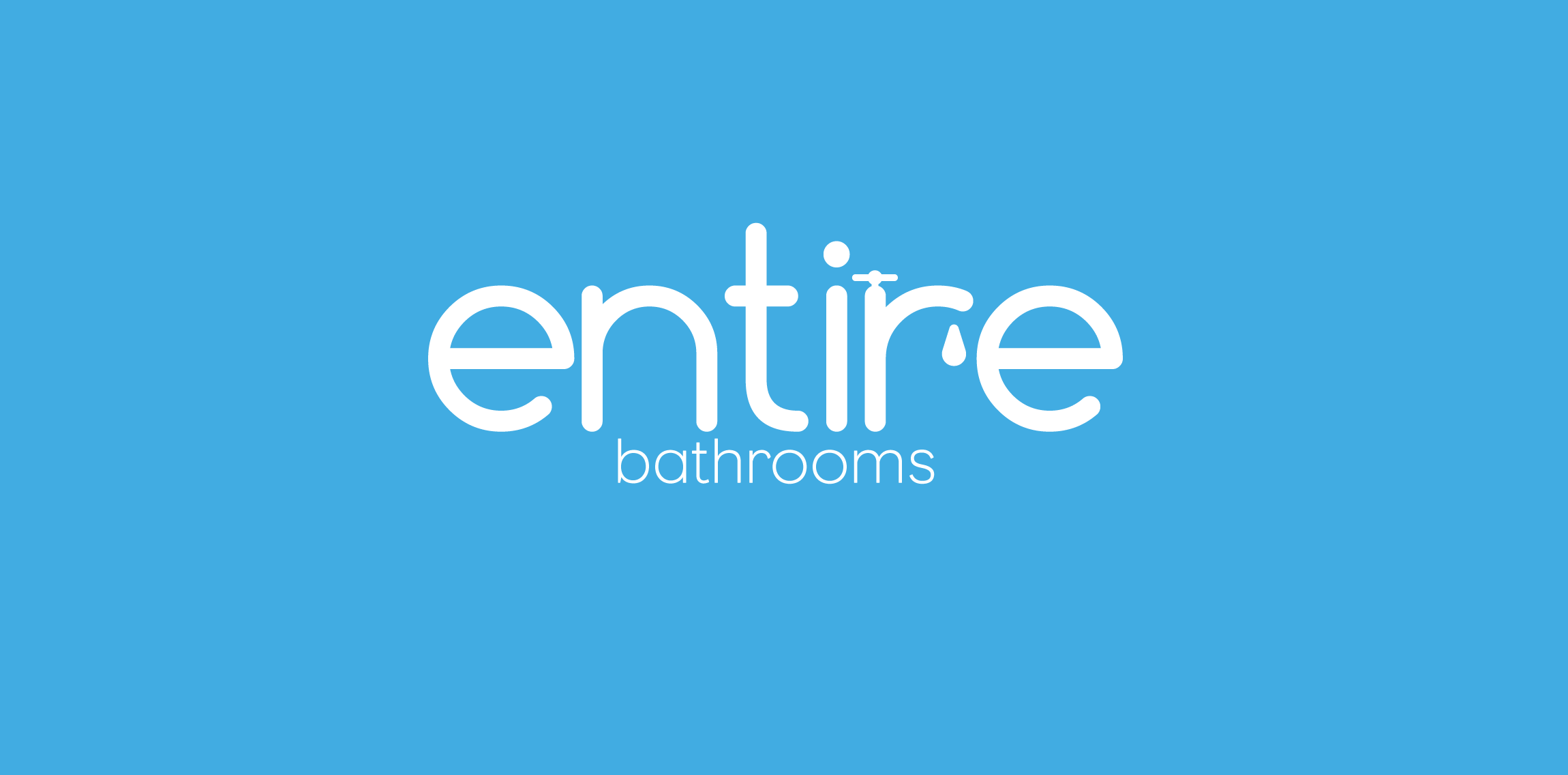
Designed for bathroom installation company based in the UK

logo for a client - a chain of refreshements supply company : "Chai" in hindi stands for tea...

21 samo


Logo designed for a luthier - www.camarotabass.com

Voip.

About the logo Hello! I'm working on a project with some cool hardcore techies. They know all about coding and stuff. Uhm, we are currently between two logos for their company. And the other version has a low-poly kind of style, while this one has a more stroke approach. Im just wondering what you guys think of this? Seen something that looks like it, does it suck? Is it great? Im open for honest feedback, I truly believe that honest feedback is the way we hate each other more, but also make better logo's!

School project "Teatr Lalek" means puppet theater

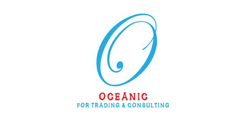
First Letter Of Oceanic co.

ASTRAEUS is fresh modern dynamic brand with short easy memorable name. It will suite well to any business or industry.
Concept for a fishing championship. Not chosen.
Small Interior Designing Company.

I am re branding my self as a freelancer so this is the first in a long line of changes to my online identity. This logo for me speaks of simplicity and slight elegance, which kind of fits my creative personality.
The logo is for a company that do comic work . and it is a dead fish skeleton whose head is (D) and tale is (N) .
Logo was created for a local painting company.