Most viewed logos – Page 473

Logo developed for a broker named Rigon Corretora de Seguros.


This logo is based on basic symbol using for dogs & cats, this company is seller of any dogs and cats food.

Logo for the electronic library.
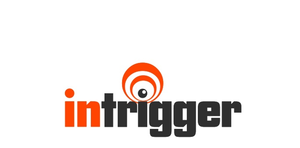
company develops software for content providers that triggers pop up registration after hitting a certain amount of click throughs... thus the TRIGGER... used an EYE because the software is watching the user waiting on clicks and to trigger the popup... thus the wave and "letter i" play


Sabra Digital Art

Logo for new asset recovery company. To be used for print, embroidery and screen print.

Logo done for fun for a fictitious sports team.

The logo is self-explanatory: Meal4u is designed as the webadress. A knife and fork stick out from the logo on the left, providing it with a recognisable shape. The colours green and orange support a modern appearance that appeals to a young target group.
This logo has been made for a french booking agency for music band.


Security company in the United Kingdom offering services to high net worth individuals/ and companies. Rubus is the Latin name that Blackberries below to - hence the 'Blackberry' shape. This forms a shield, with the leaf/crown completing the logo.
logo for software company

"The concept of a gym nowadays isn’t just about weight loss or muscular mass gain. The Oxygen Gym went through a process of brand development where we aimed to enlighten the good vibes that the physical exercise can bring. So, we presented a brand with no color restrictions so that its application could embrace all of the sports.The color pallete established isn’t an issue as long as there is contrast where the brand is applied. However, because it is a gym that offers several different sports, we decided to use more vibrant colors ."
Logo design for a fresh cleaning company startup.

Tiger Walk provides e-commerce services to online retailers including website design, development, hosting, marketing and maintenance.

Gallegos Frixione Arquitectos is an architecture studio based in Managua, Nicaragua, founded by Herman Gallegos in 2005. The goal was to achieve a modern visual style that projects professionalism.


A clean, modern design to promote a Nashville, TN based music school

...

Star Shine logo

Mustang Marketing - interactive agency from Lublin, Poland, specializing in e-marketing, webdesign and branding. More info at http://mustang-marketing.pl or http://facebook.com/agencjamustangmarketing

Motherfuckers