Most viewed logos – Page 467

Logo design by http://www.dannyglix.com/logosandbranding.htm


020 is the city number for Amsterdam. Black and red are the city colours of Amsterdam. This logo was a proposal I did for a tutoring service that's located there. They specialised in the beta subjects (maths, physics etc). Be sure to check out my other logo's too!:)

Caroline Murphy is a creative designer from Newcastle upon Tyne.

Brand identity for Line Digital

Aside from the client requesting that the idea of 'Two men and a mop' be obvious and easily understood, they indicated that they catered mainly to older retired clients and didn't want to appear too expensive. I felt a retro style would appeal to this population. The retro feel gives the dependable and honest vibe the client was looking for. The men appear to be quick, confident and professionals on their way to do a great job!

Mimry box is the name of the company. This is a logo for a piece of hardware that takes old analog video tapes and converts them, then uploads to the cloud. The idea is that you can now take all these great memories and not just back them up and store them, but share them with friends and family.

Free time work

For tango lovers! Tango logo with a couple dancing in the A letter. Under Creative Common 3.0 Attribution License.

Maxime Fredon is a french self-taught painter. He wanted a clean logotype that could reflect a personal aspect of himself as an artist. After some research & experiments, I focused on his signature, the only element that was recurrent on all his painting. It was clearly a meaningful & logic orientation.
Decision was then made to simplify it from "Max" and work on “M”, the predominant letter.
Details on the design process can be seen here :
http://www.franckjuillot.com/#1367835/Maxime-Fredon

Its for a Ferforge doors , fences and etc company
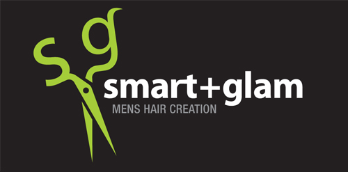
The inspiration of this logo was the scissors that the hairdresser uses to cut hair. The ends of the scissors are the initials of the salon's name "Smart & Glam". A round pattern of the scissors was made as a secondary element.
Art(fresco) & programing(code).
Objective- Simple, professional, meaningful & clean.
Symbol- art brush enclosed in html tags, art & programing working together.
Typography- curved & sharp edges used alternatively(artistic look), each alphabet approximately a square(digital look)

Micetake

dlm Daniele La Monaca Photographer
Editorial and commercial photographer based in Macerata and Lecce
Logo for The Tastmaker.

Sinverb - creative thinking (blue icon and blue dot) and sharing (icon = arrows and negative space where inside is letter S for sinverb/sharing)


Logo designed as part of a wider identity for Generous Coach http://inkbotdesign.com/portfolio/generous-coach http://inkbotdesign.com

Media Production Company

New logo for coffee/expresso bar

logo for clothing design company related to aviation

Fast Food