Most viewed logos – Page 445
Logo Concept For Clothing Company


Covesia.com | Warna-warni Indonesia is a indonesian news portal from padang, west sumatera. This is Typography and shape Logo. Use CMYK logo and blue text. Use Merriweather Sans Font with some change on character, add rounded to some character.


Designed for Pedro Rocha, Academic of Law in Brazil in 2012

A logo design for camera repair business.

PROBIT

OCasia | connecting business concept came from brand's tagline which is "connecting" business, we make a simple logogram at the middle of "OC and "asia". the logogram shows two person connect their hands each other. we use round shape to give a "continious" massage. So with OCasia, we will bult a good and long term relationship business base on trust & teamwork.
Logo for a travel software solutions company, based in Athens.


Nomadikus - tommorow's problems, today's solutions

A fictitious concept
Mexican Food Van

Logo for protector company
Integral Marketing Research. Logo designed for website.

beer
Unused proposal for an electronic dance music label, specializing in Tech House and Electro.
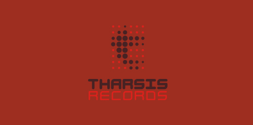
The name is taken from the Tharsis region on Mars, the largest volcano range in our solar system.
The symbol represents the blips and bleeps of the electronic music. Color is indicative of Mars. Custom type coincides with the roundness of the dots, and reflects the synthetic techiness of the music.
Click here to see the case study for this logo, which chronicles its development, and includes full design rationale, sketches, electronic roughs, and alternate designs.
Logo para construtora. Logo for construction company.
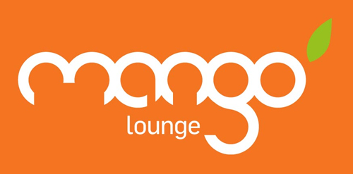
This was a second year university brief to choose a local client and show the benefits of design to a business. I choose a local tapas bar in Cardiff, after talking to the owners and a slight name change from 'Mango - Tapas Bar' to 'Mango - Lounge' I began working on concepts. After attempting to modify different fonts I created my own custom mark from scratch. Based on the shape of a mango and other cypriot fruit I realized all the letters could be formed from circles. I used this discovery to create the logotype, each letter hand drawn based on one or two interlocking circles. A bright orange colour that reflects the bar's food and atmosphere and a single green leaf to suggest freshness.
Logo for mail order Cutlery Company selling Case exclusive knives
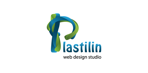
Plastilin is a web design studio in Ukraine

Bass Ace
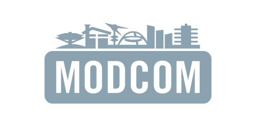
Los Angeles Conservancy's Modern Committee (Modcom) preserves modern architecture in Los Angeles

Logo concept for Polish city, Włocławek
It shows the main building plus basketball.

iGadest is a website about games, streams, videos and design.

Personal logo. My short name (: