Mango Lounge
Mango Lounge


- This was a second year university brief to choose a local client and show the benefits of design to a business.
I choose a local tapas bar in Cardiff, after talking to the owners and a slight name change from 'Mango - Tapas Bar' to 'Mango - Lounge' I began working on concepts.
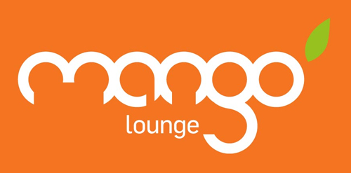
After attempting to modify different fonts I created my own custom mark from scratch. Based on the shape of a mango and other cypriot fruit I realized all the letters could be formed from circles.
I used this discovery to create the logotype, each letter hand drawn based on one or two interlocking circles. A bright orange colour that reflects the bar's food and atmosphere and a single green leaf to suggest freshness.
 Designer: designlouder
 - Submitted: 05/18/2011
- Stats: This logo design has 2938 views and is 0 times added to someone's favorites. It has 4 votes with an average of 3.50 out of 5.
Designer