
Most viewed logos · Page 44

For a UK based pharma company.


Logo for sporting blog.

Unused proposal for an interior design group.

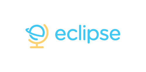
Eclipse offer specialist training software - mostly linguistic, but also teachings on grammar, syntax, etc. The use of the globe device reinforces the idea that language & communication is a ‘global’ exercise. Conceptually the design is of course inspired by a globe on its axis/stand. Since the idea of the eclipse is not necessary representative of solar or lunar, the mark focuses on how eclipses are created, orbit – The precise moment the Earth/Moon orbit is in relation to the Sun. The planet also forming an abstract E, creating a subtle monogram.

Logo design for clothing brand. Target audience men 15-30 who are probably athletes, in fraternities, and like to drink and party a lot.

Unused concept for client. I used the negative space to make the cross between both dogs. And I made a custom font for the text.

hole concept

Bohemian style jewelry designs.

Construction Company

Logo design for software for screen sharing with multiple mouse pointers


Polish Golf Union logo redeign.
This logo is good for landscape design company.

Space cafe
Elegant horse silhouette logo. Unused proposal.

The number one (1) in a form of a person jumping .
土豆主题餐厅
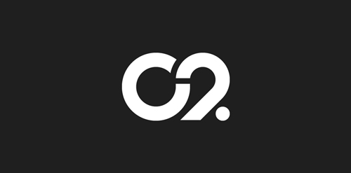
The city of Torcy, France recently built a great complex dedicated to the promotion of Culture & Arts, highlighting local and national artists. I was contacted to work on its complete Brand Identity, including Naming, Logotype, visual identity, Print communication, exterior & interior signage, website design and clothing.
The main goal was to create a total new and innovative identity. Naming took a great part in that sense. I focused on trying to create a simple yet effective name for that building. C2 was chosen from a couple of hundred names for its international recognition, pronunciation and readibility. It stands simply for Cultural Center or the two initials 2xC -> C2.
As far as the logo is concerned, it followed in a logical way the naming process. A will to create a modern and contemporary logotype, yet efficient, minimal, powerful and durable. It was created so it could nicely fit and be readable at a great or tiny size on any document. The logotype guidelines show a slight dipping of the « C » and the « . » to create the optical illusion that all characters are aligned on the same baseline.
Alternate logo for local fashion designer.