Most viewed logos – Page 385

FMCG Company


Logo para bebida isotônica. . Logo for isotonic drink


Smiley Cute Kids, vector, Adobe Illustrator.


logo peritia

Promethean Design & Marketing


Logo for a location based service called Place. P is for the pin and for the place.


"Men♂ Are from Mars, Women♀ Are from Venus". Sometimes it doesn't work very well... Perfect for a divorce lawyer.
A Textile Company
My company (design service) logo

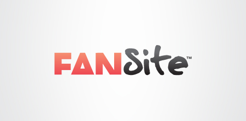
Here is one option for a logo and branding project for a brand new social network. It revolves around the idea that through Fansite, fans can meet other fans through their common interest in a musician, sports star or celebrity etc. This is signified by the choice of typefaces; ‘Fan’ is in one typeface while ‘Site’ is in another. The two typefaces have been chosen carefully to offer all the right messages and personality. ‘Site’ is written in a hand written typeface, inspired by a celebrity’s autograph which helps give the logotype a unique identity. ‘Fan’ is written in a modern, 'cropped' typeface that represents the fan community and social network aspect of Fansite. Fansite is a modern, digital equivalent of a fan scrapbook or fanzine, or at least this forms the basis. The 'Fan' typeface is modern and has a strong relevant personality itself, but it is treated in a unique way. Each letter is tightly cropped, yet still legible, inspired from old fanzines when fans would use scissors to cut and layout their magazines.

it is born on april.

Logo design for an educational foundation that helps youths develop a love for education. The logo combines a heart shape as the book cover and a candle formed out of the book spline and the sheet at the center of the book to signify the light education gives.
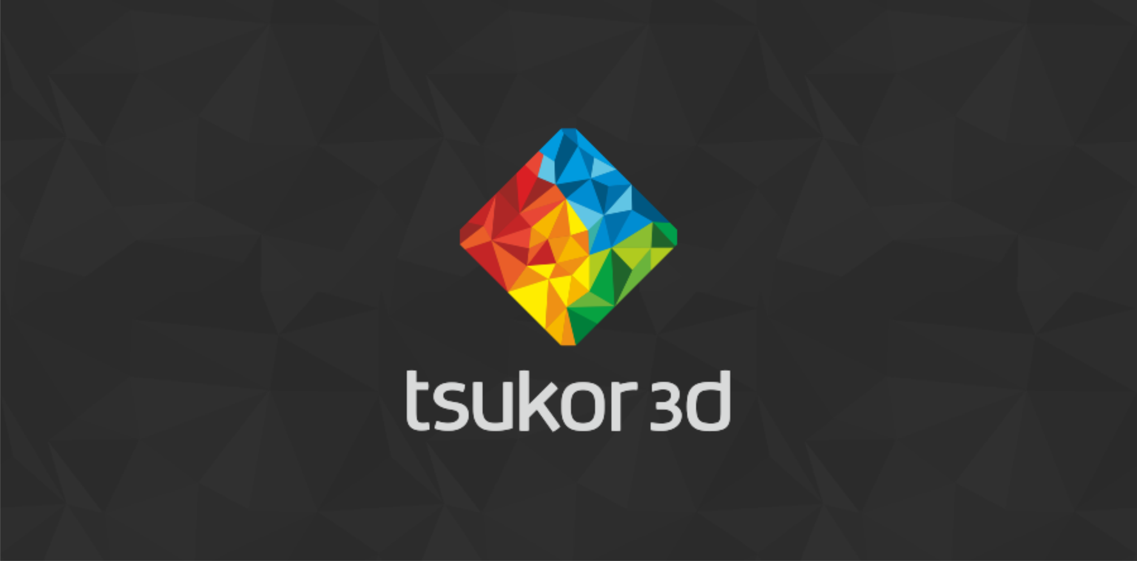
Branding Identity for Tsukor 3D - a Ukrainian 3D studio.