Most viewed logos – Page 366
Markam speed dating and matchmaking services.


logo Smooth Lashes Studio / www.nlogo.pl

Logo for the IT company Supernus

Newport Parish Council, on the Isle of Wight (UK), is holding an ‘in bloom’ competition in 2012 with a difference! Instead of judging gardens on how many flowers it has, or how glamorous it is, they are encouraging Newport and Carisbrooke’s residents to grow gardens that are good for wildlife and for the environment.

Logo para marca de confecção feminina teen. Logo for brand of feminine teen brand.

Designer: Denis Aristov Client: Sweden Group Industry: Event, Mobile Technologies, Festival Keywords: mobile, technologies, event, battle, skull, bat, black, red

logo for fishing company

Portofinio Trading Limited is a company who sell promotional materials, and also provide technology equipment to businesses.
After careful thought, in its most basic form the Portofino Trading Ltd product offering (be it promotional items or technology) helps business build connections to grow and succeed. The icon here has been designed to represent the idea of being ‘continuously connected’, growing, adapting and developing. Follow the line in either direction, and at its core you are taken back out towards a different location. Interlocking like a chain that never ends. Also looking like a propeller to represent the clients success with the support and guidance from Portofino Trading Ltd.
This icon also represents the companies ability to build relationships, and quickly adapt and see trends.
Overall the design is confident, timeless, and gives the impression of an established and trustworthy business.
View more information here: http://logogeek.co.uk/?portfolio=portofino-trading-limited

Another unused logo design project. Great for mountain motel.

Logo for a charity foundation which focuses on promoting better fathering quality for children. Trying to create an asymmetrical heart shape by tweaking the classic shoulder ride pose. :)

Monsieur Takano - Tea & Patisserie
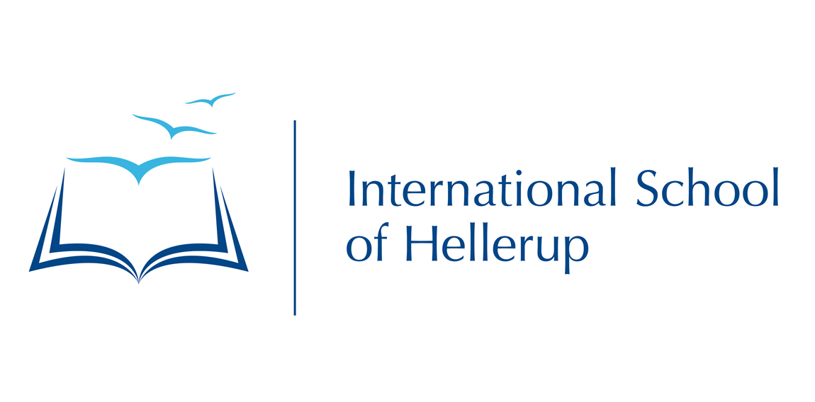
The logo for this international school, show birds flying to the school - and away from the school. Just as students often do to an international school, because they often have a mom/dad who travels a lot. Books gives you wings.


Logo for jewelry.
Logo for Danish Wave Energy company "Wavestar". As seen on their website www.wavestarenergy.com

A representation of a specific building was required for this project - the Lissadell mansion.

eman power logo for Islamic kids academy

This is WIP logo for my Swiss friend's barber shop. I've tried to create something as simple as possible, morphing letters into recognizable shapes directly linked to profession in question.
Logo mark made of a bee with collar shaped wings. Which depicts professionalism, creativity, reliability and smart. Logo for sale.
Logo/mascot for "bufet Pelikan".

Logo for Nude, a burlesque photography studio by professional photographer Nicola Cross