Most viewed logos – Page 30


Ultimate frisbee team from the Philippines.
The logo depicts two players, both made to look like birds, are in mid-air scrambling for the disc. Negative spaces is utilized to create the letter "a".

A logo perfect for a financial institution


Logo for Disney's Space Mountain I did for fun.
See design at: cargocollective.com/zangaroo
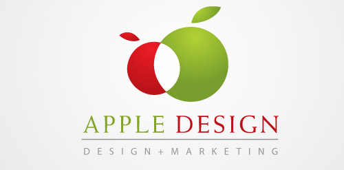
Apple in abstract in both red in green. A logo rendition of the apple fruit. Use for any of your logo design needs. Under Creative Commons 3.0 Attribution. Enjoy. http://www.logoopenstock.com/1079-Apple-Design-vector
Logo for clothing and dj's brand
An Elegant Flamingo

A logo from my portfolio that features both a monkey and a crowd!


smart snake, simple, elegant and eye-catching... smartsnake.com

Work for an aviation company. Mootto saw a glider for the first time. He drew it with all the details he could recall.

Event agency. Organization of parties

Advertising agency based on the sport
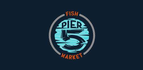
This logo is for a completely fictitious fish market.
The idea came to me when I discovered that it was possible to achieve a fish shape in the negative space within the bowl of the number 5. Dubbing my hypothetical company Pier 5 Fish Market, I created this illustrative mark in the hopes of really capturing the spirit of the nautical and maritime aesthetic. Type is custom for "Pier" and also the number 5, which is hand-rendered to look like it was painted on a wooden sign with a very wide, worn-out, thick-bristled brush. While it was important for the fish to show in negative space, it needed to look like a seemingly happenstance result of logical, real-world brush strokes. This is the minimal, alternate version of this logo.
Click here to see the case study for this logo, which chronicles its development, and includes full design rationale, sketches, electronic roughs, and alternate designs.

Run is an association that promotes sport in the unprofessional sport community, and works on expanding such activity.
Bioengineering logo

Design Proposal for a colleague designer starting a branding agency.


This logo was created for fun. Elements: palm holding and protecting a blood drop. Meaning: every drop of donated blood is valuable.
Bird illustration logo design
This is a logo for sale A minimal and professional logo. It can works for many business like, design studios, video games, video game clans, surf, jet ski company, and many more. More info at http://graphicriver.net/item/hunter-logo/634852?ref=cooledition