Most viewed logos – Page 273

This is our logo, for our agency. It´s made of hair, because we have a lot of hair in our head and we decided to use it for something useful. Thank you for looking!


Logo redesigned for The Leela. The element of peacock is used to symbolize royal and loyal service which The Leela group provides to it's customers.

This logo was uploaded on 99designs.com The CH want for the logo that it oposite with the company name. It means not playful, just strong and simple. So this is logo I come up with. The reason why I upload this on here is for seeing any critique and suggestion. I'm sorry for my bad english. Thank you :)
Dieduong logo

Marketing agency. One of initial proposals presented to the client. Spot-on solutions. Arrow hitting bull`s-eye. Rotated 90 degrees clockwise could also work as an exclamation mark.

logo for spa minimalist
My personal logo inspired by geometric shapes

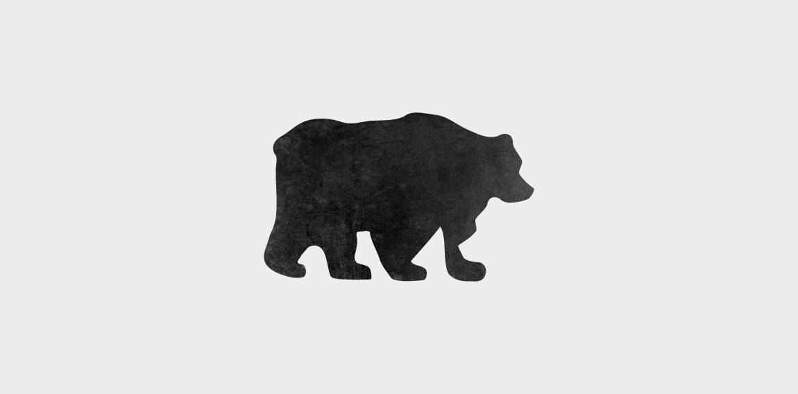
Clever, negative-space concept representing 2 bears.

His name is Ivan, writed on Russian He write melodic texts for websites

Go Around Nigt Life Magazine
Sayed Essam is a 16 years old Designer based in 10th of Ramadan City, worked on himself in the design field since the age of 10, started working on multiple graphic work since 12. Ambition is what keeps him moving, struggling to achieve his dream. Working on himself in manipulation, motion graphics, web design, branding, marketing and social media. Creativity, Quality, Self Learning, Improvement and Hard-Working been his habits forever.
Organic and mineral cosmetics.

logo for a films and tea lovers society

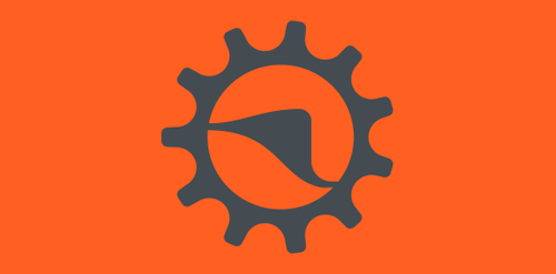
"An element of the bicycle and an element of Whitestone (Local Store). For bicycle use the ratchet teeth 11, which symbolizes the march is more of a bike, and to White Stone, symbolized with the hill that is a landmark of refência. Together the two symbols form a rising sun, referring to the idea of a new and sustainable world.”

Travel project. See more on Behance: https://www.behance.net/gallery/48782927/BRONIX
Our logotype.

Bread and cuisines

London based menswear clothing brand. Client wanted Winston Churchill depicted like Mary Poppins (flying off with an umbrella) with a bottle of gin in reference to various icons of popular British culture.

HEDGEHOG + BRAIN. Creative logo for creative buiness. For sale.