Most viewed logos – Page 250


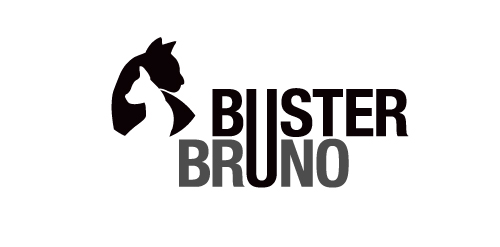
This is a personal project to create a positive/negative identity for a typographic illustrative children’s book called Buster Bruno. Simple use of the distinctive profiles of Buster and Bruno my two cats uses the negative/positive space to created logo mark. The linking of the u from both words unites the two cats as they are brothers.

Custom hand made family fashion for children and their parents. Pulcino means "little chicken" in Italy.
the logo made by letters I&H + the shape of Hammer
Find me at: http://www.upwork.com/o/profiles/users/_~01322354571058e06e/ or at: orlandochora@gmail.com
Logo for Properties Red Sea company located in Hurghada, Red Sea

Unused idea for a travel agency

Logo for an audiovisual producer

Logo for Marketing Communication Association (unrealized)


Logo for Google Chrome search extension
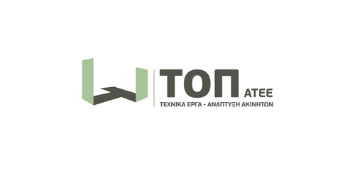
The inspiration of the identity of this construction company was the actual foundations of a building under construction.
A 3-dimentional symbol was created based on letter “T” (The initial letter of the company’s name) as the base of the construction, expressing the company’s values, such as trust, accuracy and professionalism.

Logo for boutique in Philadelphia. Blend of hanger and umbrella.
Simple and modern logo.

Architectural design bureau. Designing in building. Technical advice. The name "constravia" relates to the scandinavian roots of the bureau founder (construction+scandinavia). The mark relates to the letter "C".
Chameleon Logo Design Template
Custom typography unused logotype proposal for bicycle parts manufacturer.
Monogram for grocery company

Logo for a money transfer company
In the designer's words: Lettering full-bodied for a combination of letters used in amazement. To design agencies, graphic design, web design and media who want to impress clients with their products. A young agency that is placed on the market with a spirit of innovation. The lettering is also a perfect ambigram / Ideal for these industries: Entertainment & Media, Art & Photography, Design & Creative Services.
"Avasarga" means relaxation in sanskrit

ASIO is fresh modern dynamic brand with short easy memorable name. It will suite well to any business or industry.


Safari logo design