Most viewed logos – Page 229

Brand Brothers helps Archgéo, a consulting and engineering office in archeology and cultural heritage in its full rebranding. Using a minimalist but meaningful graphic, the new identity emphasizes the economic aspect (the tower), the French culture (the hexagon), and notions of quality and sophistication with the font created for the occasion.


ForMusic Foundation promotes contemporary classical music. The mark combines the letter "M" and the triplet notes (in music notation http://pl.wikipedia.org/wiki/Plik:Viertel-Triole.png)


Croquis web design


Victoria is a financial fund based in Warsaw. The key was to combine a eagle (symbol of Poland) and V letter (for Victoria). There were several concepts - some modern, some classic, more decorative with a pinch of victorian styling.

Designer: Denis Aristov Client: Panorama Industry: Food Keywords: tapas, bar, bull, Spain, bullfights, corrida, food, red, yellow, round, arena, sun, sand, typographic, T, horns

Unused concept logo for royelly.com. For sale.

Some experiment about verbicon, i hope you like :)
Haunt Jaunt 5k Halloween event logo

Design made for a company based in a small village called Urk in the Netherlands. They Buy and Sell salmon.


Logo for Old Irving brewing company

Based in Albany, NY & Washington DC, Solomon Law Firm represents federal employees.
Logo design for an American custom clothier.

Check Quick Social app: https://play.google.com/store/apps/details?id=cc.lupine.quicksocial


Investment company
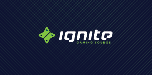
ignite is a Chicago located place where you can hang out playing in your favorite video games, enjoying a good coffee, beer, make new friendships or just having a good time with old good pals. Main objective was to obtain a mark which in clear and simple way communicate the nature of the place which represents + design custom typography to show an uniqueness of this place. We decided that the best solution would be a combination of two game controllers (symbol of game community) in the shape of the d-pad which also refers to the form of sparks, which is a direct reference to the IGNITE name. Full ID http://bit.ly/XkAZ43
A logo design suitable for companies that offers IT, Media, Communication etc.