Most viewed logos – Page 204

NTIMM > A Montreal based studio. Not That It Matters Much.


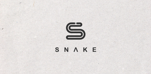
A logo is simple and straightforward. A letter S formed by a snake that turns on itself. Inspired by the famous game. Easily reproducible and recognizable.


WILLIS MARINE - Custom Sport fishing Yacht Builder


Advertising agency.
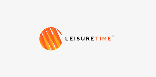
Custom logo design I did for Leisure Time in 2012.

Prayers for Paris and prayers for justice.

Designer: Denis Aristov Client: «Пермский краевой перинатальный центр»(The Perinatal Center of Perm Region) Keywords: Perm, perinatal, center, hospital, clinic, medicine, baby, head, flowers, Children are flowers of life

Venture investment business, focusing on early stage consumer internet and mobile market, both in North America and China.
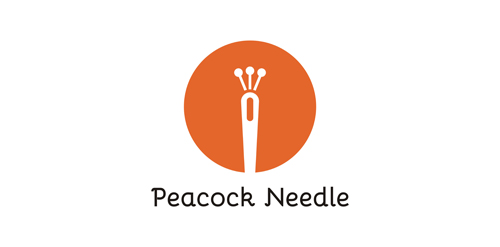
Perfect logo for clothes and sewing. For sale.

Exclusive Customizable Logo at Eisaks Logo Design

Pet photographer

The Eggcellence project was born from an idea of three ambitious minds whose aim was to create a brand new style for web applications, design and branding. You may be asking: Why an eggcell? Well, an eggcell has got the native innovative potential to produce something excellent. This potential made concrete in the present is represented in the logo by the cooking of the eggcell.

Restaurant

Espeero Distribution Company for computer hardware in Iran. www.espeero.com

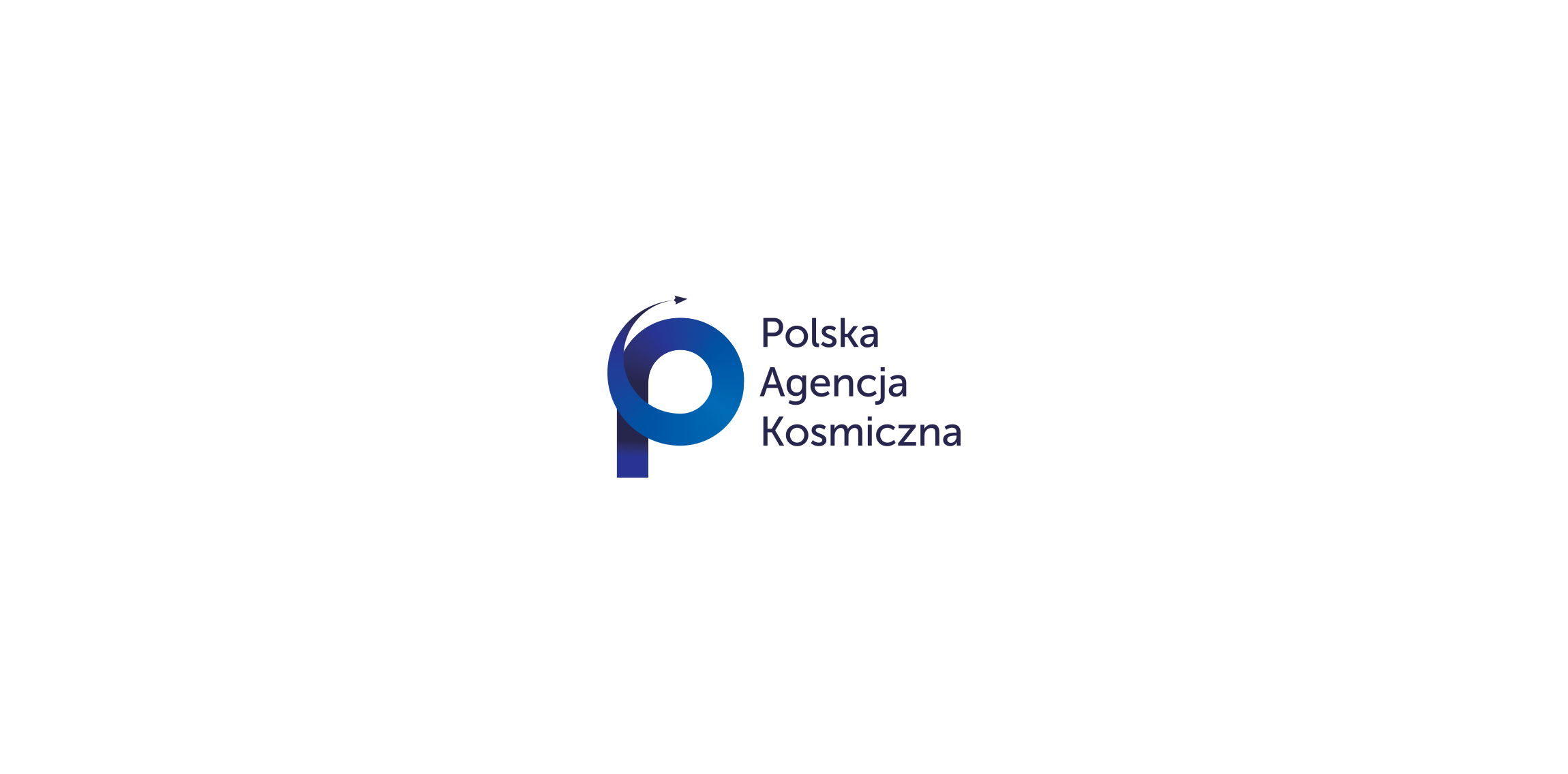
logo for Polish Space agency. Several concept combining Poland (as a country shape), rocket/space shipt and orbit.
Logo Proposal made for signaling academic class work.

Was inspired from our culture in the Middle East. When a person speaks a foreign language fluently , he is called bulbul (a kind of birds ). I used a negative space technique to make speech balloon from the bird .

sleeping goods
Kochzauber (engl. "cooking magic") business logo
Logo of an autism association

The company is developing applications for the iPhone