Most viewed logos – Page 159


"The material and the natural." "Synthesized through the "J" all kinds of material used in day-to-day of their projects as: wood, concrete, cement, sand, gravel. And for the letter "A" seek transpire the natural side, plants and foliage used in their projects.”

A logo I created for a start up business.

This was made for the Anne Klein official logo redesign competition held at talenthouse.com. This variant is the redesign of the previous logo - the lion became strong, attractive and up-to-date.

Logo for architectural company.
Edka Digital is an independent, digital creative agency located in Barcelona.

Logo for Saudi Company in Communications , Networking and Information Technology.

this logo was designed for the retail environment solutions company

Retro and modern logo. For sale.
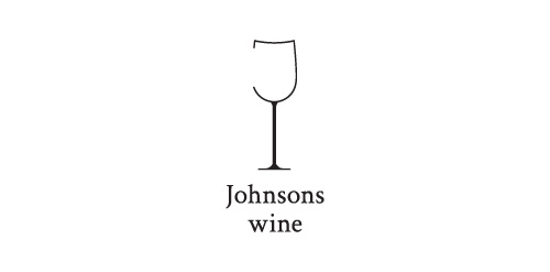
Logo for a little family wine business
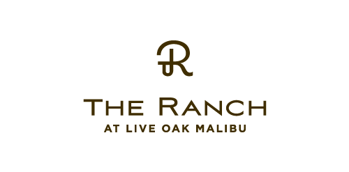
The Ranch at Live Oak Malibu

Logo proposal for a pharmacy. Logo shows simplified mortar with a pestle. What do you think about the concept?

Monogram8

logo Radiologie
InBest&Co (Financial Services) - (MEX)

https://www.facebook.com/yaceky

Toy store

Designers Against Child Slavery - http://www.dacsunited.com/
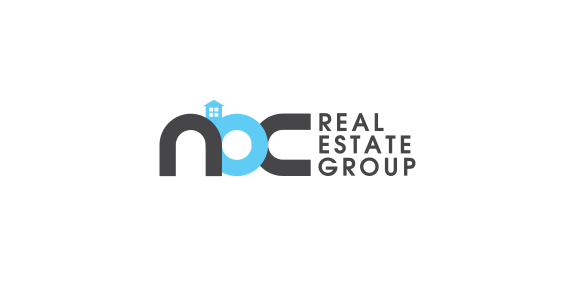
Real Estate

A friendly and fun Buddha surfing the internet. Available for sale
Balena italian cosmetics
A work in progress