Highest rated logos
Most rated logos – Page 75

bird


Team Logo.

Bread is the Staff of Life

Logo for a marketing company. In the symbol, you can notice initial "w" of wise, crown (chess figure) and movement/moves, that makes strategic/strategy plan which also makes the letter w.

Detailed information on food and recipe

clothing store

..

Folk-metal band

This logo is designed for a company who's product is a half inch cube made of a petroleum product that will burn even after being submerged in water. This will help you get your camp fire started. The client wanted to give the logo a feel of a product that has been around for awhile, so the design took on a retro look and feel of the old cigarette lighters.
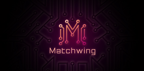
Logo description: A Web design (graphic, 2d animation) company logo. Design based on simplified graphic of matches to form "M" which it also look like circuit which represent web solution. The side of the "M" is in spread out form, which similar shape like wing.


