Highest rated logos
Most rated logos – Page 61


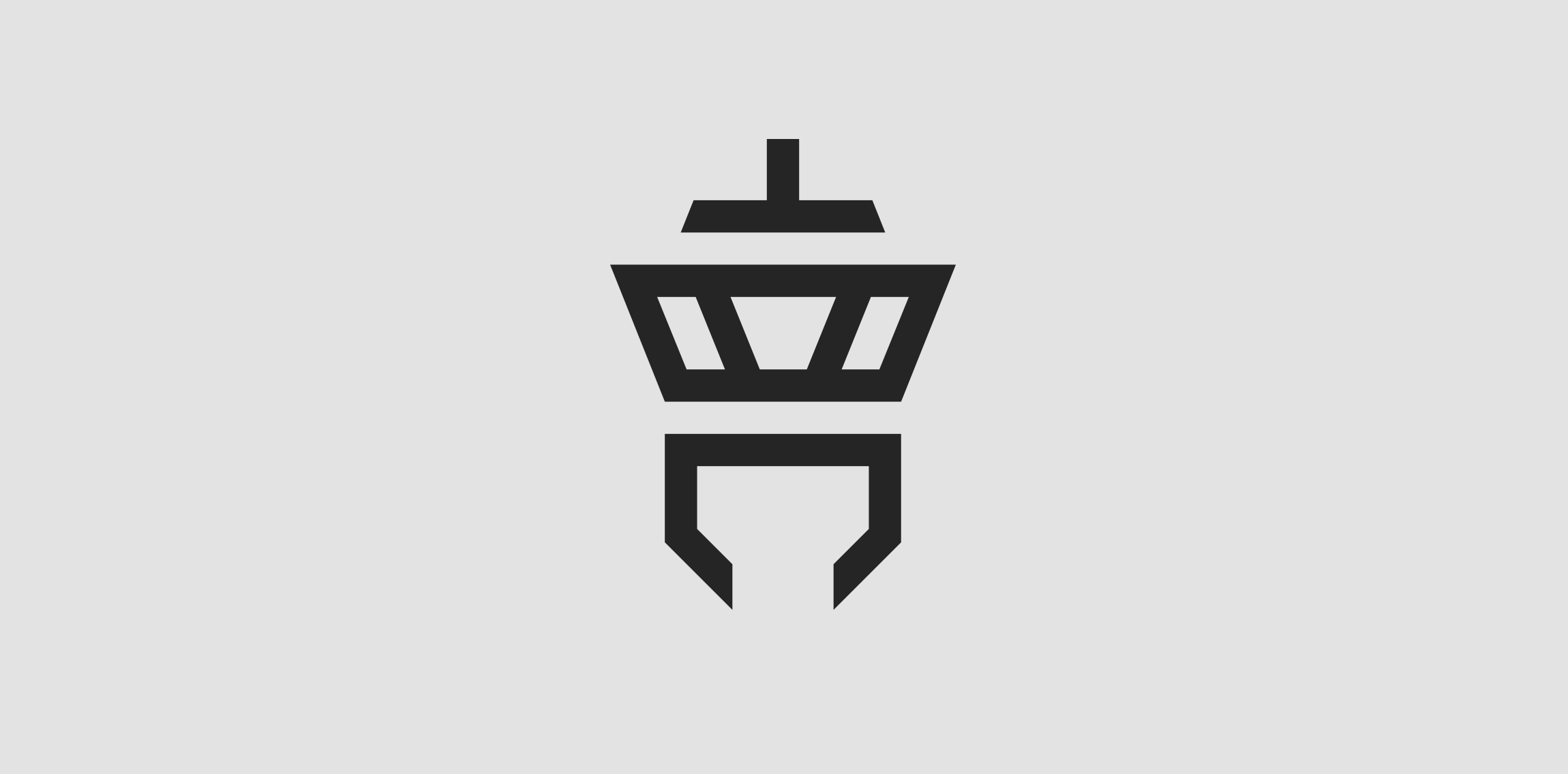
Client: Tower Communication The customer‘s wish was to have an abstract depiction of an airport tower in the logo. The antenna of the tower is an upside down T (for “Tower“) and the lower area is a downwardly open C (for “Communication“).
Slide verbicon

Logo for Pieces Auto Pro (unused proposal)

It was a rainy day here so i made this for fun :)

First - F1rst - wordmark concept.
Selfie

.

One more poly. Reupload. Just trying out a renewed LogoMoose. Looks cool so far!

Customizable Ready Made Logo Design http://wp.me/s4571j-moontech

Its logo about A Design Studio
simplifinia Means Always thoughtful,
simplifinia means suffering from simplicity,
simliplifinia who believes in simplicity.

Brand name : Rogues Gallery / Field: Animation, vfx / Year : 2012 / Location : USA
Logo was made for the web-based business management software systems.

township

Logo for company which provide servers for bloggers. Logotype created in my old style (two meanings in same icon). You can see lab tube which made from newspaper.

Producer of timber houses.
The client wanted to emphasize quality, nature, beauty, uniqueness, trust and avoid references to traditional symbols (roofs, doors, windows, buildings) used within this industry.

Logo was created for site deappetizer.com. Deappetizer.com is for people, who used to eat a lot, but decided to do something to reduce their appetite. Idea is simple and clever in my opinion: the site presents unpleasant pictures, which should spoil your appetite. And before a meal you can visit this site to change your perception of food for a while. All of the pictures are divided into three levels by their effect. The further the stronger. Concept: imagine that «Deappetizier» is very unusual restaurant, where guests come to refrain from eating, so the primary duty of a waiter is not to allow a guest to eat. All the waiter’s efforts to discourage guest’s appetite formed the basis for a series of logos for each level of pictures: Level 1 https://www.logomoose.com/members/alisa1711/showcase/logo/244/ Level 2 https://www.logomoose.com/members/alisa1711/showcase/logo/245/ Level 3 https://www.logomoose.com/members/alisa1711/showcase/logo/246/ Also you can see logo in bigger size and on the white background at http://revision.ru/work/36475/