Highest rated logos
Most rated logos – Page 397

Restyling of the following logo: https://www.logomoose.com/pending-logos/beauties-model-staff/


NETBOTS - new technologies company.
International Creative Solution Consultancy Company
Pittore Vineyards is based on Napa Valley, CA. The logo is featured on their 2010 & 2011 wine collections.

Law Firm

Silver in the City, the unconventional gift shop located on Massachusetts Avenue in Indianapolis launches a creative rebrand. Originally a jewelry boutique, Silver in the City had gradually expanded its offerings to include housewares and other gift items.

This is the symbol for Crown Tenant Advisors, a Medical Realty Consutation Firm. The intent was to give a new company a simple, recognizable identity by incorporating a skyline into a crown.

Logo for real estate

Logo for travel
To create the Saniport’s logo, the element of inspiration was the water. The logo is thus made up of two droplets whose colors represent the duality / balance of hot and cold. When water vapor meets a cold surface (as in a toilet when bathing, for example), some small water droplets appear, represented by the logo particles.
Logo designed for an artificial grass company
This logo represents the water colors on a swimming pool, the shapes also want to translate the waves and the different formats of the swimming pool .

Logo for male gift service...

Logo for food brand

Logo for a kidney therapy clinic
Logo designed as part of an identity for Johnson Modi Capital Ltd.

Concept proposal for branding for go cloud.

Unused Proposal for an art studio specially for kids

Brand identity for Line Digital

This was for a logo submission. They are wine photographer. Name comes from fall leaves...so I used a simple illsutration to combine all together.

Logo for a call unmasking service

Mobile application logo : enjoy exclusive benefits in Saint-Tropez !
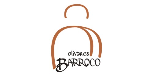
This logo is based on several very identifying elements Olivares in Baroque era and today, at first glance identifies the typical silhouette of a woman of high society of the time, which highlights the use of the wig and skirt with bell shape. As Olivares identification element has taken the shape of the skirt typical of the period to represent the tunnel, also called "El Camarin" that exists between the Collegiate Church of Santa Maria de Las Nieves and the Granary. Identification have been incorporated and timeless texts representing the whole.

ecological package delivery company