Highest rated logos
Most rated logos – Page 391
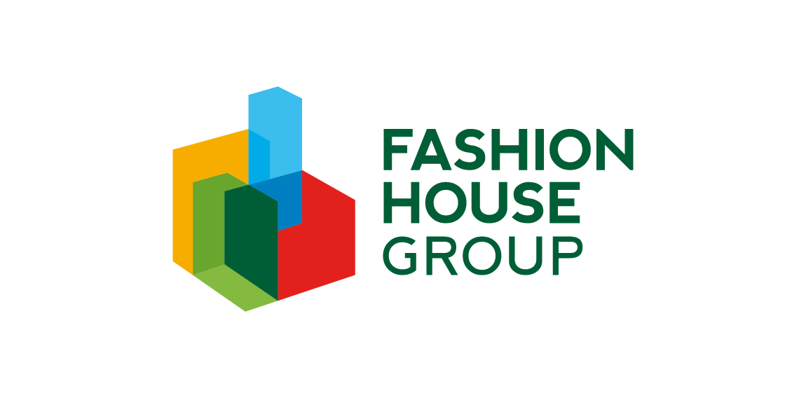
FASHION HOUSE Group is a developer and operator of fashion outlets from UK. A rebranding – the new logo was developed from a bold and surprising, albeit logical evolution of the old logomark. The abstract form of rising geometric solids invokes associations with both developer and operator activity of the Group. It references spatial dimension, development and growth. The colorful and multipart construction of the mark reflects the wide spectrum and multiple directions of FH Group’s activity. Graphic motifs derived from the mark’s structure form spectacular configurations to be used in layouts of publications and advertisements, while the colour palette allows building navigation with use of the colour code.


logo for a real estate company based in mexico.

Company Logo

Company Logo (Wine Sector)


MEE - woman fashion company

Personal entertainment eatery club

Kelowna - audio video company

Floor and Carpet company

Online ticket server

One of the entries. Logo design for a company dealing in breeding varieties of bees Viking.
This is the Straight North logo. They are an Internet marketing firm that specializes in logo and graphic design. The logo uses light, bold complementary colors that are appealing without being too harsh on the eyes.
An idea of the logo as a birthday present for a person, who is falling into various stories associated with the salvation of people, due to his specific nature.

SPORT WEAR
Logo created for Columbia Memorial Health which provides health care services across New York state.

Rent a MINI car in Warsaw

pakobus - vans renting

Photography

A sign promoting a free Organic Food icon set – https://www.behance.net/gallery/24471401/Organic-Food-Free-Icon-Set

Cardinal Pictures is a student-run filmmaking organization from Wesleyan University. This logo is part of a comprehensive rebranding.

Online music player

Hand crafted isulated pet house company in Ireland.

pizzeria
Logo Design

Vector logo created for a multimedia studio. The challenge was to make a static logo look like it had motions. We created this by slicing the first and last "N" so they match up to make a pattern and cause a continuous loop.