Highest rated logos
Most rated logos – Page 390
Real Estate


https://www.behance.net/gallery/7960947/Centro-Psicosocial-Estar-en-Camino-branding Hospital Escuela de Salud Mental, Dr. Carlos Pereyra, diseño de branding realizado en el año 2011 para un Programa destinado a la reahabilitación de pacientes que padecen patología psiquiátrica crónica

https://www.behance.net/gallery/8174829/RN-equipamientos Equipamos camionetas para usos diversos. Equipamientos para ambulancias, transporte de pasajeros, cargas especiales, familiares, móviles de trabajo, cargas de baja temperatura, Motor Home y transporte escolar. También cubrimos el segmento de 4X4, donde ofrecemos barras antivuelco, estribos, cobertores plásticos, lonas cubre cajas, defensas, ganchos para traylers y ambulancias. Estrategia creativa Creative strategy

https://www.behance.net/gallery/33251891/Dr-Castaneda-Ferreyra-Law «Nació por la necesidad y el deseo de sumergirme en el mundo del derecho laboral. Si bien se puede brindar otros servicios que tiene que ver con el derecho civil (desalojo, contratos, cobro de deudas, etc.), el mundo laboral es lo que apasiona del ejercicio de la profesión. Defender y/o luchar por los derechos del trabajador es un honor que se puede realizar día a día para mejor las condiciones humanas y/o económicas de ellos».
Design for looking numbers logo
The logo was created for a company offering glass services in Wroclaw, Poland.
Logo for print services
Logo for nutritionist and and professional athletic
Neuro Dropin is an award-winning charity that supports people and families affected by a range of neurological conditions. Hotfoot created a new logo and brand identity for the charity to highlight their warm and welcoming presence in the community.
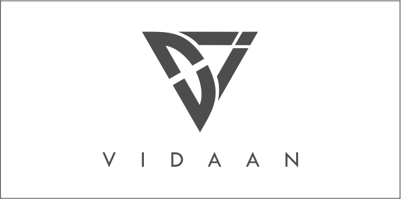
V I D A A N characters to be in the logo symbol and display the charactor of all of them uniquely. Alongside, we also wanted to have one important aspect of our attitude to reflect in the logo, a fast growing attitude! A fast growing attitude, we would like to provide our esteemed cusomters and also derive for ourselves. And to reflect the same, an upward and forward direction ARROW came much close to our imagination and rational thinking. Hence after a lot of time and creation. we came up with this logo.
Logo Design for Resort
Quirky logo for a tea shop / manufacturer.
Logo for Fiber Novelty
Logotype for the civic association Hafira (blueberry).
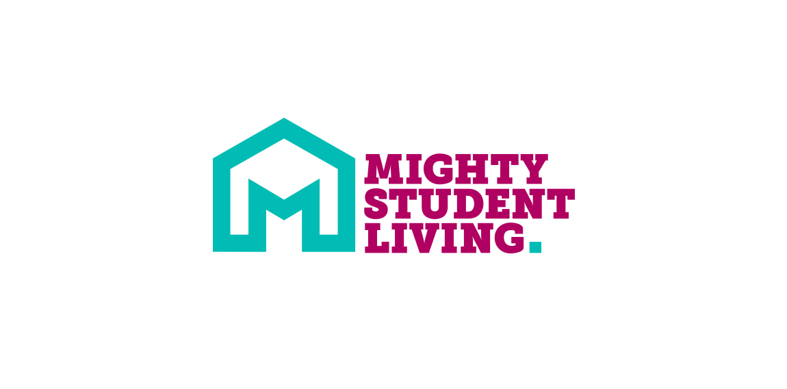
Mighty House founder Peter Charnley already has a very successful high street estate agency, the brand, and website for which was created by Hotfoot, and he approached us again to create a new brand focussed in the highly competitive student market in Lancaster.
logo for sale ;) Medical systems etc.
Brand Identity for an events management company

Interior.

VinaBook is an online book store.

Logo developed for a business consultancy. The logomark represents both searchlight and strategies.

A nice and unique logo featuring a bull's head created in a tattoo style in some nice color combination of blue, red, orange and yellow.

Tres Magos is Spanish for the Three Wise Men / Kings / Magi The name, referencing the distinguished foreigners who visited Jesus after his birth, bearing gifts, was meant to represent a producer of smart furniture for children, designed according to the Montessori education method. The logomark portrays both the Magi – as three coloured silhouettes or wizard hats, as well as Kings – in the form of a crown, which symbolises also the highest quality of products. The pleasent colours, rounded corners and use of basic shapes, signals the childrens theme.

CST is a training company. Symbolism of a chess knight is central to CSTs strategy. It exemplifies dynamism and initiative. Basing on these qualities and the target group in part the automotive branch I have referred in the lettering and composition to the aesthetics of sport cars emblems. Over the course of many sketches, I have created a convincing, minimalistic silhouette. Rendered as negative space against a chess square, it creates a bold, cohesive and legible mark.
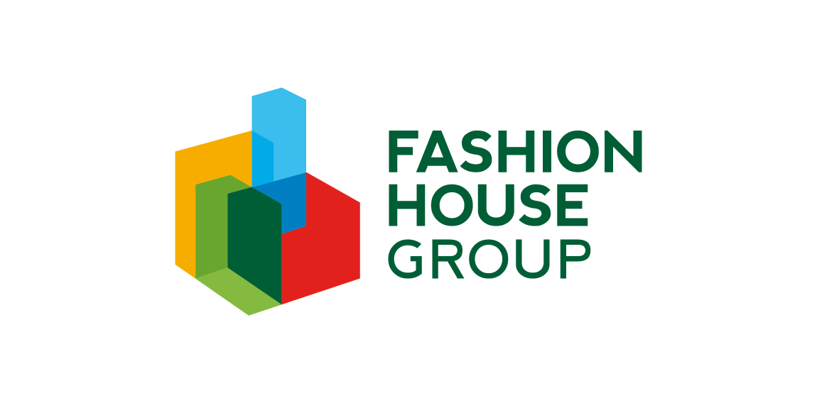
FASHION HOUSE Group is a developer and operator of fashion outlets from UK. A rebranding – the new logo was developed from a bold and surprising, albeit logical evolution of the old logomark. The abstract form of rising geometric solids invokes associations with both developer and operator activity of the Group. It references spatial dimension, development and growth. The colorful and multipart construction of the mark reflects the wide spectrum and multiple directions of FH Group’s activity. Graphic motifs derived from the mark’s structure form spectacular configurations to be used in layouts of publications and advertisements, while the colour palette allows building navigation with use of the colour code.