Highest rated logos
Most rated logos – Page 379

CRASH


WINGO is fresh modern dynamic brand with short easy memorable name. It will suite well to any business or industry.

Logo of blog skippers.

mini-grocery. More: http://gladhead.com/Basket

IPAP is a research institute and public opinion based on Cruzeiro do Sul in Acre, Brazil.

FEXOM is fresh modern dynamic brand with short easy memorable name. It will suite well to any business or industry.
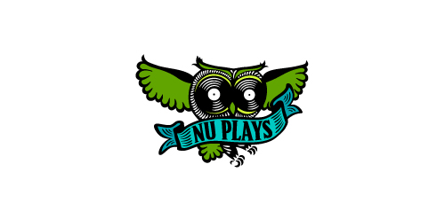
A new, exciting way to buy music online! NuPlays.com is the first music marketplace where artists can sell their music and merch worldwide, directly to millions of music lovers. Making buying music fun - again!

Logo for company dedicated to trophies

Social web platform

Logo of the game site.

seals and stamps

Web Design Studio

Submission for a contest.
Cathijane - custom typo logo for a web design studio
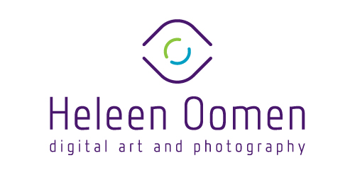
Heleen Oomen is a photographer and digital artist with generally industrial themes.

The company provides electrical and electromechanical services
Human resources company.
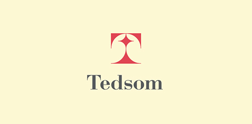
Half-symbolic, half-typographic concept. I have started with a concept of a road leading ahead, with a guiding star above, showing the way. Then, I had to add top serifs to get the letter "T", and with a little stretch of imagination it could be interpreted (or rather the negative space it creates) as the night-sky`s sphere.
I am pretty happy with the shape I have ended up with. It is purely geometric, simple, elegant, unique and strong. Of course it is also the initial of the company name, and the hidden message can be viewed as added value.
keywords: "T", professional, trustworthy, solid, experienced, elegant, simple, guidance

free work

Logotype created for a women's online fashion website.

Branding for Historic Royal Palaces Fanfare brochures - unused proposal.

logo for web travel service

FONIXS is fresh modern dynamic brand with short easy memorable name. It will suite well to any business or industry.

Logo for the forum.
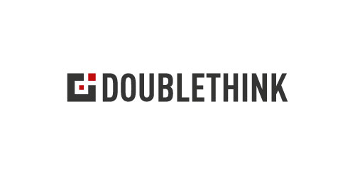
New logo for digital design studio Doublethink, based in Glasgow, Scotland.