Highest rated logos
Most rated logos – Page 289

C my eye


Golf Club PLatinium

logo for the restaurant

Lingerie shop logo
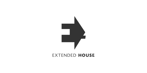
Extended House. Negative space used for the letter E. The house serves as a perspective to this letter E.

Handmade shop

This is a logo for a company selling fire-resistant feature.
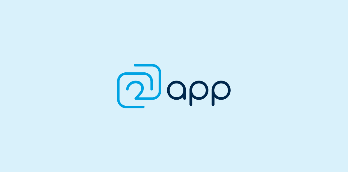
This logo was designed for an application development company from The Netherlands. The logo consists of two application shaped merged into a symbol and combined with the '2'.

S+F monogram in mark Final version of startersfund logotype.
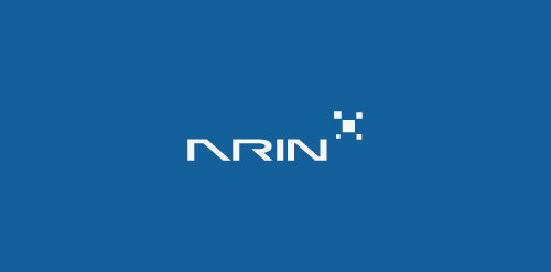
Full Project on Behance : http://www.behance.net/gallery/ARIN/2286746

This is the logo for the transport company.

for small animation studio
http://www.facebook.com/yaceky

Logo for Disney's Space Mountain I did for fun.
See design at: cargocollective.com/zangaroo

Logo perfect for lounge, bistro, bar or winery
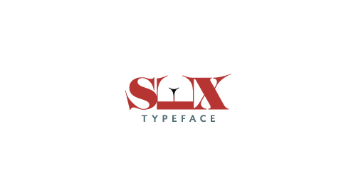
Sex Typeface Logo

Logo for egzecut.

Puma illustration

Logo design for a translation website using two overlapping chat bubbles to represent translation and also forms a globe.

http://www.facebook.com/yaceky

Logo created for AV8 solutions company.
Logo for web design company.

logo for electricity company slogan "maximum energy"
logo for publishing company. Features thin sans-serif font with wide tracking a simple book design with hatch shading for added depth. Made in one colour to enable its use on various coloured backgrounds via simple colour change. To be used on stationary, web and on books of various colours.
Proposal for a danish real estate broker. "Dal" is Danish for "valley". Custom typography.