Highest rated logos
Most rated logos – Page 215
Dumma Branding is the design house of Duminda Perera. Duminda is currently involved in an ongoing logo project for design every day one Original, Clever, Wordmark/Verbicons or Negative logo.


Some experiment about verbicon, i hope you like :)
Dumma Branding is the design house of Duminda Perera. Duminda is currently involved in an ongoing logo project for design every day one Original, Clever, Wordmark/Verbicons or Negative logo.
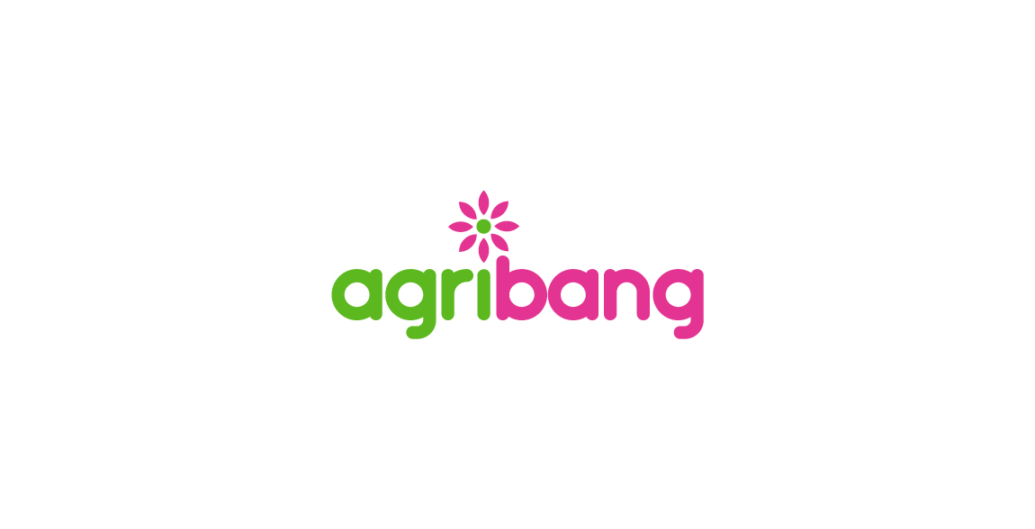
is the concept of agri-agriculture and bang = impact by, in a new approach agriculture impact (Revolution). Looking for design, while maintaining the image of the traditional agriculture feel the strength and impact. I want to get design of the company than the mark.

Conceptual logo design showing a windmill with two barbells as the masts to help represent health and fitness. For sale.

Scott Sanford is a fitness coach and instructor. With this logo a went with a modern but slightly gritty approach. He fell in love with this concept.

Logo for web design and development startup. Give me your opinion.

Logo design for a hunting travel agency, Lebanon.

White Eagles combat clothes is a company from Zrenjanin, Serbia which manufactures combat and military clothes for everyday and specialized use from exceptional materials.

Logo for event management company

Emblem for a quality coffee dealer and cafe shop.

Logo for a gay friendly holiday resort. The logomark shows fig leaf (naturism) with a palm tree (tropical) in the negative space. The logomark is also playfully phallic in nature which the owners where very receptive of.

Yachting Service - concept --- www.nlogo.pl
project management
Overview The company – Boutiquette, online boutique selling affordable clothing made from natural high quality fabrics, from up and coming designers. Challenge Developing a memorable, fresh and creative logo for the Boutiquette brand. The logo should relate to the name Boutiquette, which is a combination of words boutique and etiquette. The task was to create a visual identity which would convey edginess, creativity and style.

Logo for electric wheel brand
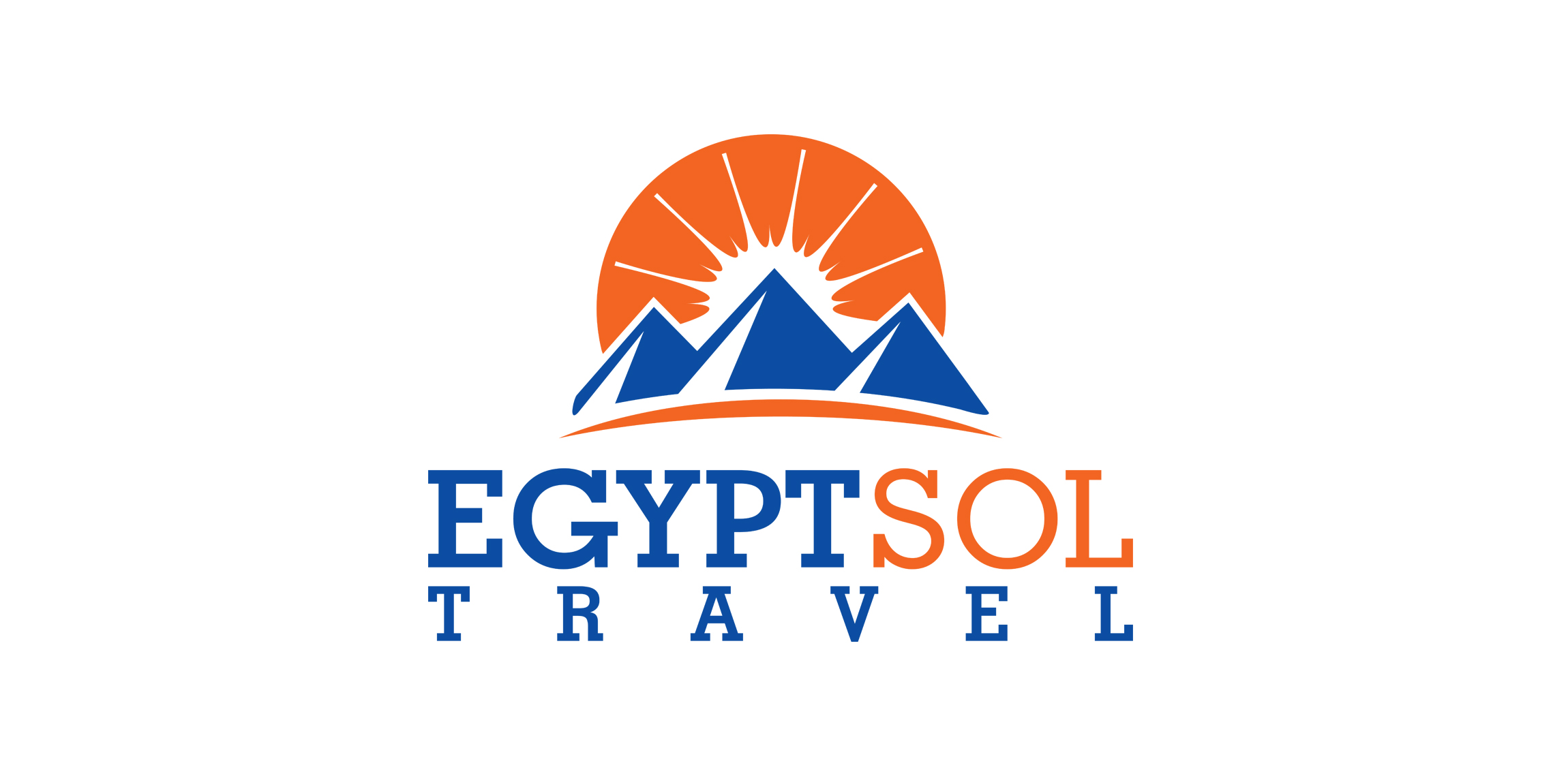
Logo for a travel agency located in Hurghada, Egypt "Sol" means sun in Spanish.

Soy Bolivia is a nonprofit project aimed at promoting social development through the arts and culture of Bolivia. Our mission is to promote cultural appreciation for the arts and be a space for generating the union of ideas, creative ideas and preserving the cultural heritage of the nation.
Coffee Truck - logo design

Sidd & Laine’s mission is to help the world shine a little brighter with jewellery and accessories that look great and make people feel fantastic. The collection consists of jewellery that is lovingly hand-made by artisans in northern India. Designed using natural, semi-precious stones, the range compliments styles as varied as boho-chic, the oh-so glam socialite or even the jeans and T-shirt kind of gal. We were thrilled when we were commissioned to design Sidd & Laine’s brand identity. Aiming to attract a fashionable female audience, the new logo incorporates a geometric shape based on authentic Indian patterns. Serif typography, a vibrant colour palette and luxurious print finishing, like gold foil, were used to combine an elegant and exclusive personality.

Logo for a Jazz Club

https://www.behance.net/gallery/20834447/ARTE-Y-ALMA The Present brand 's strategic objective is to represent and communicate VIA visual signs UN Joint UN microemprendimiento Linked With The Environment and Health of the skin, Made with offering flowers , herbs , spices , rare oils , and Completely hand , sin Chemical preservatives . Broadcasting ASI art and Soul In Health Of Team . The beauty of women and men , constructed from elements of nature and spirit Mendoza . Thus was born The New Image Art and Soul " The Pleasure of the skin."

Nugno is a company that was formed when two compatible and creative individuals – Luca & El – came together. Grafting in collaboration, the pair multiply the excellence of their work, producing result- and experience-driven work. Their mission was to design an identity to define a distinct brand style that communicated the core values at the heart of the business – passion and creative brilliance. The final design combined a minimal typographic aesthetic and simple colour palette to create a distinctive visual identity communicating the purity of their style.
Proposal for French company selling corkscrews. Unused.