Highest rated logos
Most rated logos – Page 202
farm food online store


An upcoming website for floral agreements & such.

Destiny is a telco company that offers next generation dsl services and fiber to the home.
.
Logo design for the Millennial Wave, 2010.

fun logo

it's a fluid-like logo because the website is all about after effects and motion graphics... I choosed fluid because it refers to motion and like that it can be easily remembered.

H designed using two hands

Logo for a consulting company. The idea behind the logo is: kangaroo jumps - level up, kangaroo has a pouch - savings.
Logo design for a Manchester-based Collective, 2011.

moon beauty of women
Logo for lounge in Alberta. Spoon is in negative space.

A logo designed for a business owner.
Logo for jewelry.
Revamp

bikeblack

Logo design for a fitness/consulting, U.S.A. The company formed is a personal training/lifestyle coaching company targeting higher end clientele.
Logo design by Mehdi Hassan Liverpool for iCom Voice, one of the most promising Telecommunication Service Providers based in the UK.

A logo proposal for a media agency.

New logo for Rhodesian Ridgeback kennel in Germany.
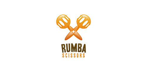
"Rumba Scissors" is a fun logo depicting two symbols merged within one, a pair of scissors and the second, a pair of "maracas" music instruments.

I made this ligature a little time ago, but know I create some kind of logo with this stuff.

Splashy logo made in a complete 3D finish.

Logo for a jewel artisan association. In the amazon area