Highest rated logos
Most rated logos – Page 149

flower Shop


Logo for the cottage community.
Unused logo proposal for ONST Creative.

Logo represents referee whistle but also represents cannon.

Cheese producton

my personal logo "chameleon.design", black-white. Chameleon likes pencil :)

Building concern, idea
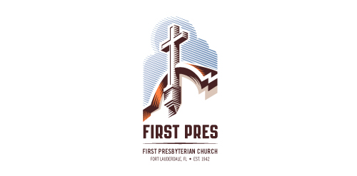
Redesign of the church's old logo in a stylized, illustrative manner, making it more welcoming, contemporary, friendly, casual, & upbeat. Client specified a rendering of the church’s architectural arch and cross in the perspective in this photo, and required an emphasis on the church's nickname, “First Pres."
Here, crisp, exacting vectors emphasize the architectural soundness of the church — a metaphor for the concept of faith as the solid foundation in one's life. This design makes use of hatching to add gradient dimensionality, enabling it to easily reduce down to 1-color. Colors are indicative of the building itself, including terracotta roof. Check my Flickr case study or Dribbble for more images, detail, and full design rationale.

Elite High School

The concept for "Danish Wine" incorporating a bottle of wine in their flag.

Want Ads website
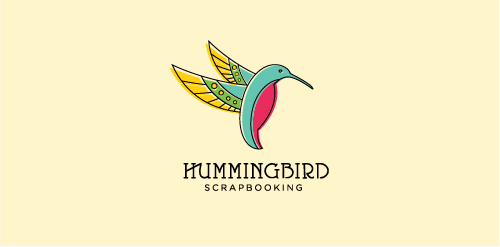
This is an unused proposal for a retail store selling products associated with scrapbooking.

Unused proposal for an activity sport clothing manufacturer. Target audience: Motorcyclist, shipman, hunter, rider.

Dutch cafe-bakery

Company Profile broad, it is marketing, mediation, building services, building works.

Unused logo for a sushi bar. I created two cute asian girls for this project, but it turned out I had chosen an inappropriate direction.

Ferrethills would be my place on the web, so I focused here on the very me style. I hope you like it!

logo made for gaming industry

Unused proposal for a snowmobile related company.

Logo for an an online estate agency called steeple - client work

Logo for store with branded toys for children named MAKAK (macaque). The symbol of monkey should have been found in the mark. Client wanted the logo to be associated with fun, unconcern and childlike jokes.

U letter in negative space :) !

Logo for the 'Festival of Arts and Multiculturalism'.
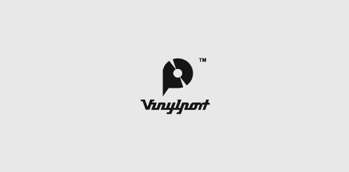
Vinyl Shop