Highest rated logos
Highest rated logos – Page 97
Logo design for Aberystwyth based web design company. The logo depicts the shoreline of Aberystwyth and doubles as a mountain symbolic of the Cambrian region in which the company is based.


Logo design for the IT company GTP

Logo for sailing site. www.livera.it
We recently completed this logo for Townsend Real Estate & Art Gallery in Maine. She wanted the logo to encompass the fresh coastal air of Southern Maine.

My business logo
Branding for a local band called Half Life. I used a concept for the logo that was fitting to the band name and would work across the board on album covers, promotional material etc.
For chemistry lab in Zielonka/Poland. There are many trees in this place.
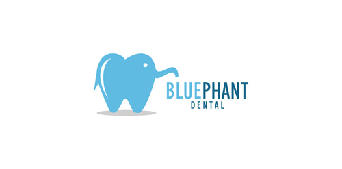
Logo was made for pediatric dentist. Cute little elephant in the shape of tooth.

House Logo

Online education at home

Just for fun

ONEYE MAN is fresh modern dynamic brand with short easy memorable name. It will suite well to any business or industry

New work is here! Branding and packaging design for a Swiss cosmetic line-up. Check full case study in my portfolio. www.dominikpacholczyk.com

Consulting services.
http://www.facebook.com/paulvonexcite

Logo for web developer.
Logo show spider web. My client is building web, as spider is building his spider web. He is also ready to work, you can email him at: kamil.habrzyk@gmail.com
Ready to work - pkowal98@gmail.com

Restyling of the logo for shop of design sunglasses (for hipsters). www.lookatsun.ru

OmniQuest Living Logo

Hi, friends! My new logo for transatlantic shipping company, icon symbolizes package and wings, which means fast and secure service.

spiritual site

Antivirus for android

Logo for special packages food delivery company

Emblem for indoor soccer team Callippus. The shield forms a letter "C" and "11 (Year of Establishment) The tiger represents our playstyle of rapidity, technique and slyness.