Highest rated logos
Highest rated logos – Page 83
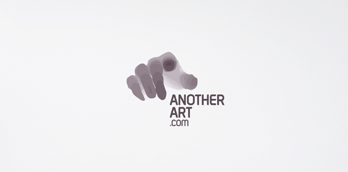
Logo for designer's site. The whole project you can see here: http://www.behance.net/gallery/AnotherArtcom-Identity/2120118


'Druk' means 'Print' in Polish language. Drukulla is the name for online printing service in Poland.

Exclusive Customizable Logo at Eisaks Logo Design

Logo for Creative Tools - Afro Brand Agency
Developed for a series of self-enrichment events entitled "Choose Love," this logotype was created to be instantly recognizable, whimsical, and inspirational. By stacking the eventʼs name and carefully editing key letterforms to maintain legibility, a heart appears to connect the words ‘choose’ and ‘love,’ bringing emphasis to the eventʼs mission.
The Choose Love experience combines a variety of creative exploration sessions, guided meditation, and yoga to help participants gain personal insight. The visual campaign included the development of the Choose Love brandmark, promotional poster, and event branded buttons distributed to participants.
© Keith Kitz, All rights reserved.
Logo for Kumite School
Fashion House Logo

audio systems

Madness Production is a company specialized in the production of porn movies.

:)

Waterfall concept typo

Logo idea for NAWF.
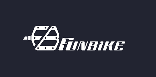
Funbike logo

Logo for Aintu - company involved in Big Data processing.
Full branding presentation - http://www.behance.net/gallery/Aintu/8058535
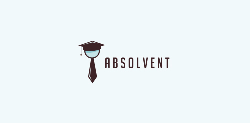
In icon you can see hand glass, tie and graduate cap.

Psylocibe Games logotype, created based on frame created with circles. Combination of mushroom and game pad, font Roboto Slab.

Listek in Polish means Leaf. Stek in Polish means Steak, so we have a "LeafSteak" :)
Alternative logo design for one of my branding projects. Final case study you can check on www.dominikpacholczyk.com/ronwe
Logo for GreenPlate

tea walla logo

Logo for company which sells board games. "6 oczek" - means 6 pips on a dice (in Polish). Also word "pip" means "eye" in Polish so it's a little wordplay :)

data storage service

Logo for mobile games creators

Publishing House Logo