Highest rated logos
Highest rated logos – Page 59
Logo for graphic design studio.


Logo for mountain resort complex.

Love Hair

cool icon with a swan and a diamond shape inside it for jewelry, handcraft oriented or not.

butterfly
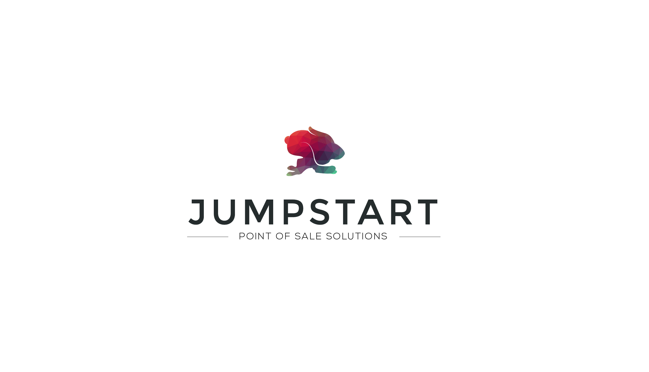
Jumpstart POS is a point-of-sale solution provider specializing in providing custom bundles on a HaaS (Hardware as-a-Service) basis.
RuouNgon

Ape Lu is a italian fashion boutique located in the most fashionable street in Warsaw/Poland. Ape means Bee in Italian and the client wanted it to be in the symbol. We wanted to keep it clean, elegant and modern.
simple logo designs lovelive

"Drone Solutions" sell, consult, train, rent and repair drones for various commercial applications like aerial photography and industrial inspections etc.
Fast delivery pizza.
Logo for a bakery
A simple Indian bird logo design

logo designed for pizelato immagine corporativa's anniversary.

Simple and strong logo for dog shelter.

Grabbit

BADDAY is fresh modern dynamic brand with short easy memorable name. It will suite well to any business or industry.
Logo`s for builder company

For sale!

Logo for a Dutch full-service internet agency.
Pixeleator.com is my own company, for design, print, host and web design..

Logo for Lake Wilcox Brewing Co.from Richmond Hill, Canada

Pulse concept typo
B for bakery identity. Identity for a French bakery located in the Netherlands.