Highest rated logos
Highest rated logos – Page 55

Bullen Tea is a specialty tea retailer with a social conscience. We bring to our customers first grade teas that are certified organic and fairly traded. Before tea makes its way to the hands of customers, like most products, it will go through a supply chain: tea pickers, traders, auctioneers, factory workers and blenders are involved in this process. Tea pickers, being the ones further removed from the customers in the supply chain, are usually victims to poor working conditions, very low wages and little to no government support. Our goal as a social business is to solve these problems by creating awareness; setting high standards and ensuring our business partners have proper working conditions and wages to all of their workers; and being ambassadors to local communities.


Logo design for Phoenix Textile Products who are based in Dublin.

Designer: Denis Aristov Client: KS-Stroy Industry: Housing Estate Keywords: a tasteful housing estate, housing, estate, development, victoria, V, initials, pinestrawberry, red

БMA | Design Union

Logo proposal for web company called webnoodle. Inspiration for mark was a bowtie noodle shape. It is also a WN monogram.

G
This logo successfully represents this land developing and civil engineering firm as a contemporary business with their eye on the future. The mark is inspired by a standard target tool used in their industries. Because the majority of W+A’s clients are from within these industries, this provides an excellent communication. The negative space from within the typography creates the “+” in the name, but also serves as a crosshair, as seen in the tools of their trade.

Unused logo proposal for Hart&Hound

Logo design for a Dutch website that lists all day out trips from around the country. The logo is shaped by a foot and the outline of the Netherlands.

Law company The number 1 is used in the letter P as a negative space.

Group of energy equipment manufacturers

Like us on facebook: www.facebook.com/hunapstudio
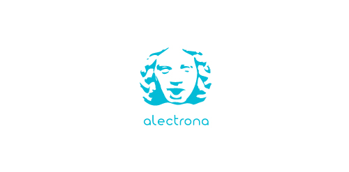
ALECTRONA is fresh modern dynamic brand with short easy memorable name. It will suite well to any business or industry.
logo for a coffee shop based in mexico.

my personal logo "chameleon.design", black-white. Chameleon likes pencil :)
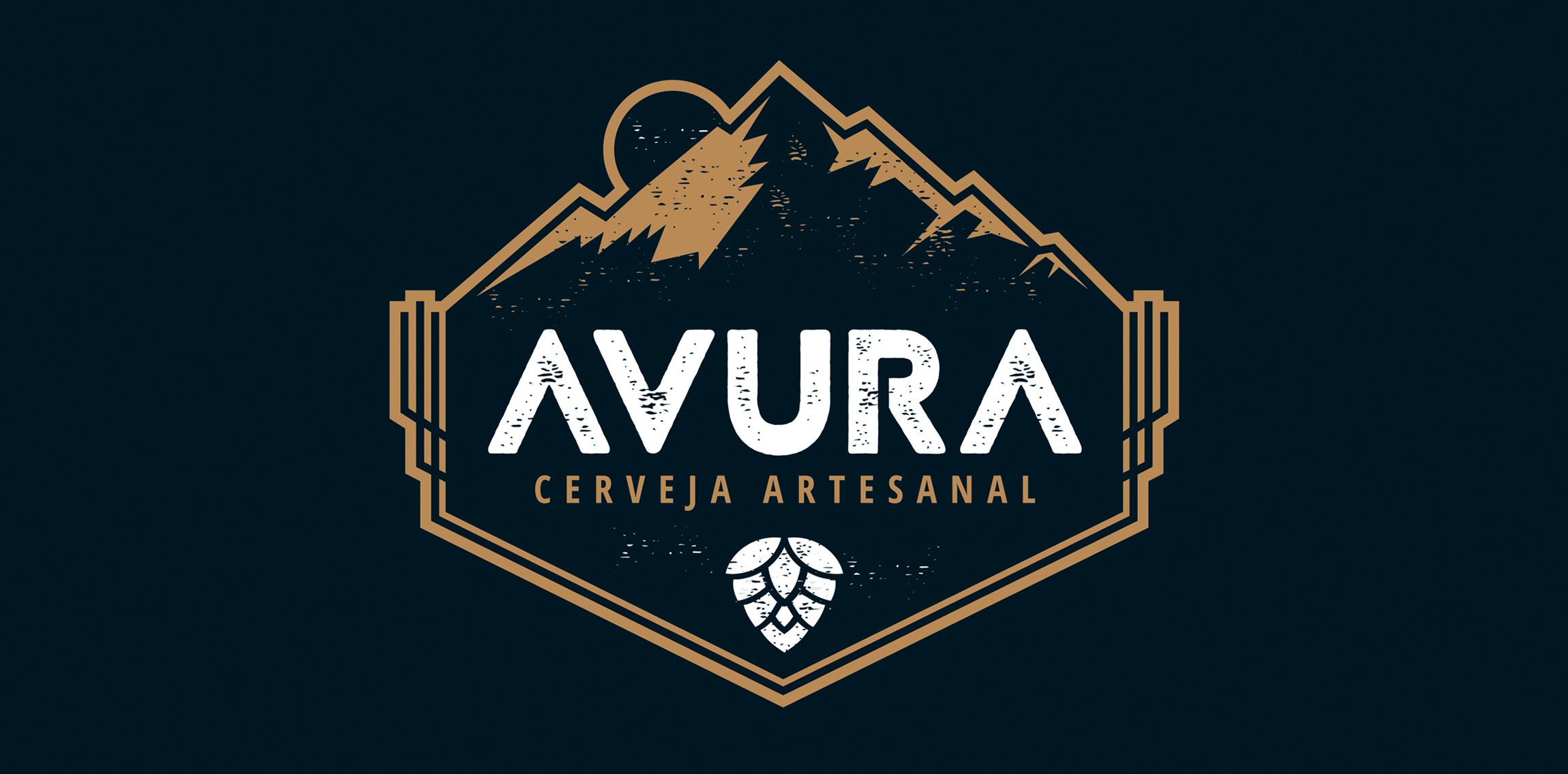
The artisanal beer developed by Avura - Minas Gerais - received new look through the brand developed.
With rustic typography and having the mountain range as a symbol, refer to the geography and regional aspects from where the product is.
Unused idea for a shopping centre

For a forex trading brokerage firm. The mark is an arrow formed by the letters V and R

Web company. A slogan of company is energy of web server.
The letter 'X' + Heart (Symbol) Get More Info: http://drbl.in/otZM

We are building an online travel experience and brand focused on socially responsible travel. We are teaming up with international experts, government agencies, nonprofits, small businesses and communities to revolutionize how people plan and experience their trips. We are young, hip and forward-thinking with our finger to the pulse of pop culture. "Vaya" is the command "go!" in Spanish. "Vayable" is pronounced like "viable," which means capable of living, growing and developing adequately. To connect people through travel for the sake of creating happier, more authentic and sustainable experiences for travelers and the communities they visit. honesty, ingenuity, authenticity, adventure, compassion, ambition, edgy, cooperation, optimism, efficiency, wisdom Using the negative space to combine two concept which are the Google pin and the concept of logo(Vayable). Take the trip, change the world.

.
A unused logo concept made for a beer enthusiasts forum.

A Thai-Japanese joint venture business, metal-recycling.