Highest rated logos
Highest rated logos – Page 420

Logo for a travel agency . Can be modified as per name


University Pharmacie
Payne Language Logo
Logo for nutritionist and and professional athletic
Organic Food Shop

TV commercial post-production agency.

brand for Event Organization & Music Production
Inspired by the ancient Japanese art of folding paper, the negative space from an origami-styled “D” creates Diploma’s icon. Using a deep charcoal colour treatment on a bold stylized version of the Museo Sans typeface, the identity combines vivid aqua and chartreuse colours, designed to strengthen the company’s fortified position as “the definitive partner for medical device sales in specialized healthcare markets.”
The logo was created for a company offering glass services in Wroclaw, Poland.

Stefania Striccoli's Knick Knack Dance Company
Logo is the answer to the nature of the application which is map of people and companies.
In terms of typography letter V is presented as a marker.
The space between the characters is divided into 3 parts rhythm which refers to the password flagship applications, "Be (here with) You"
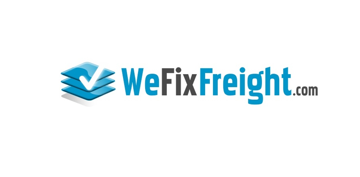
Technology company that fixes unbalance freight on trucks, shifted pallets etc, causing driving delivery issues and delays when loaded wrong. Went with pallet stacked properly image with a checkmark for success.
This is a simple beautiful vector art.
Two coding brackets containing all the coding symbols like a coding machine, allowing only a one by one product to be released on the moving line .
Logo for print services

A logo express about speed

Be cherry is a Mobile telephony provider company.

Restyling of the following logo: https://www.logomoose.com/pending-logos/beauties-model-staff/

Nothing set but u can check simply CI here http://bit.ly/Nb8pyc

Company Logo

A Visual Communication Company, based in the United republic of Tanzania. Http://www.emagod.com