Highest rated logos
Highest rated logos – Page 39


Logo created for an audiology office in San Antonio, Texas. The shape of the logo represents sound waves.


Prabhu Natarajan - Personal Portfolio

Logo for a Jazz Club
One of my logo designs that I made for fun.

A logo to promote the use of electric/clean vehicles.

A logo for a ministry. A contest submission.

Bullen Tea is a specialty tea retailer with a social conscience. We bring to our customers first grade teas that are certified organic and fairly traded. Before tea makes its way to the hands of customers, like most products, it will go through a supply chain: tea pickers, traders, auctioneers, factory workers and blenders are involved in this process. Tea pickers, being the ones further removed from the customers in the supply chain, are usually victims to poor working conditions, very low wages and little to no government support. Our goal as a social business is to solve these problems by creating awareness; setting high standards and ensuring our business partners have proper working conditions and wages to all of their workers; and being ambassadors to local communities.
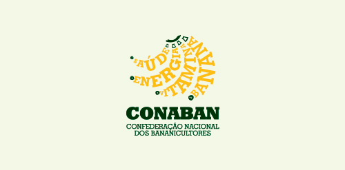
Logo for the National Confederation of Banana Producers. (Brazil) Meaning: Saúde = Health Energia = Energy Vitamina = Vitamin Banana = Banana

SumoMania logo for Sumo Suit hiring company in Adelaide, South Australia by DivParty

Logo proposal for web company called webnoodle. Inspiration for mark was a bowtie noodle shape. It is also a WN monogram.

G
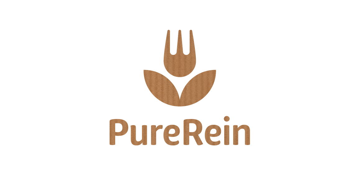
PureRein is a producer and distributor of healthy food Its founder, valuing the work of designers, like Polish logo design legend – Karol Śliwka – wished for a classically simple logomark. The created graphic combines symbols of a fork and a flower, representing food, nature and happiness. The fitting font is rounded, organic-like. Working with the Purerein brand consisted also of designing an extensive series of packaging with hand drawn illustrations of plants associated with the products.

naming and logo created for a mobile device app.
This logo successfully represents this land developing and civil engineering firm as a contemporary business with their eye on the future. The mark is inspired by a standard target tool used in their industries. Because the majority of W+A’s clients are from within these industries, this provides an excellent communication. The negative space from within the typography creates the “+” in the name, but also serves as a crosshair, as seen in the tools of their trade.

Logo design for a Dutch website that lists all day out trips from around the country. The logo is shaped by a foot and the outline of the Netherlands.

Logo for a coffee business, inspired by aboriginal art, for sale on BrandCrowd. http://www.brandcrowd.com/logo-design/details/63863

Law company The number 1 is used in the letter P as a negative space.

The visual identity project developed for the company specialized in Tenders & Distribution, in Florianópolis - Brazil, aimed to reinforce the concepts of excellence and trust, pertinent to the business. With the use of an exclusive typography and a symbol with a modern design, consisting of a continuous line, referring to its broad and solid performance, the company is moving towards its goal of obtaining national prominence.

http://www.facebook.com/yaceky

BADDAY is fresh modern dynamic brand with short easy memorable name. It will suite well to any business or industry.
Bodymasters is a fitness equipment manufacturer out of Rayne, Louisiana.

ANGEL is fresh modern dynamic brand with short easy memorable name. It will suite well to any business or industry.