Highest rated logos
Highest rated logos – Page 38

The Thailand's automotive parts manufacturer (CNC)


Power tools

Logo for University Pharmacy. Letters A (for Apteka - means pharmacy in polish) and U (for University) creates an icon of a pill. The cross in upper right means medical connection of the icon but also express high quality of service by association with letter A. In result: A plus.

Logo for competition - Gdynia Design Center in Poland.

free mail service
An Apparel Showroom
Logo for Polish political forum. The project idea is the possibility of expression different political views in a reasonable and substantive way. Unused proposition / 2012

Logo for a music production company which includes a stage, a microphone and curtains.

logo created for a family company based in mexico.

Power sources - logo for the psychologist who's main focus is sources of woman strength.

Unfinished project for a technology company.

Based in Denver, Colorado, Tenacious Landscaping is involved in projects ranging from town to country gardens, and uses both traditional and contemporary styles. Our design work for the Tenacious Landscaping brand coincided with a revised content and monetisation strategy. So we chose the wild beauty of the bighorn sheep, the State animal of Colorado for this vibrant company’s brand identity. Boasting horns that can weigh up to 14kg and an intrinsic part of Native American mythology, this animal captures the spirit of Colorado wildlife and reflects Tenacious Landscaping’s brand values of power and elegance.

cool icon with a swan and a diamond shape inside it for jewelry, handcraft oriented or not.
Dove
A brand name and logo design for audio related business.
Keto

JF Assessoria de Imprensa
One of the brand marks I’ve done at the end 2015. „N” for clothing company from Chile. // www.dominikpacholczyk.com

Logo SONIC. take a look for Sonic brand identity on Behance. www.behance.net/gallery/Sonic-Corporate-Identity/2742871


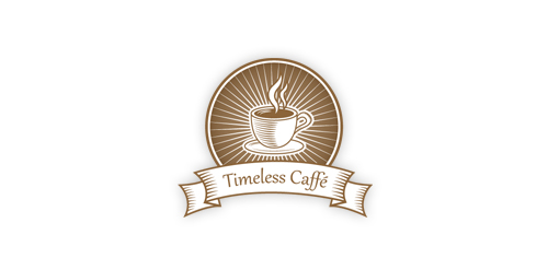
A perfect emblem for any retro/vintage caffe.
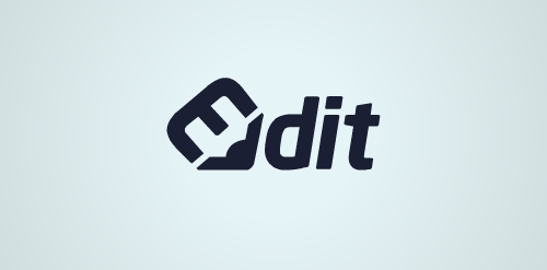
concept : pencil / edit / typography
Logo for Tokyo Bicycles.