Highest rated logos
Highest rated logos – Page 372

This logo was designed for an application development company from The Netherlands. The logo consists of two application shaped merged into a symbol and combined with the '2'.


LOVE sausage

Logo design for a motion graphics studio.
Logo for a photography site megapixel8.com. At first I was focused on going the pixel route and utilizing that but then I wanted to emphasize on the mega aspect of it.

QUAQUA is a Fashion brand

Human Garden - sales and marketing


Logo for the forum.
Lawyer Office The three letters means the first letter of the owners name.
Yourlink is company (human resource) in Thailand

Empresa de Limpieza

Logo I've designed for local textile print workshop focused on printing music, games, movies, web and pop culture oriented merchandise.

Training - Consulting and promoting Co.

...
This logo is for a service for create toolbars, named One Click Bar.
Tourism Company in Malaysia.
Elpram is a firm designing electronics
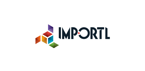
This is a logo for a completely fictitious entity named IMPORTL, which could be an open source web development site, or some type of developer software.
The idea is that the triangular facets form a series of open holes, or "portals," in multidimensional space. The central facets can also be seen to form a cube which is open on three sides. Lying before each opening is another opening on that side's respective "floor," yet, in an Escher-like paradox, where spatial orientation is an irrelevant construct, there is no floor. There is no up, down, left, right, back, or forth. This hyperspatial environment suggests infinite possibilities for the arrangement, manipulation, and exchange of data.
For color, the idea is that the primary colors that form the central cube beget the secondary colors that rotate outward, suggesting expansion, transformation, evolution.
The mark employs a custom typeface that compliments the angularity of the mark.
Click here to see the case study for this logo, which chronicles its development, and includes full design rationale, sketches, electronic roughs, and alternate designs.

Luxurious leather accessories for women. Products are self-designed by client and handmade by a team of experienced craftsmen.

Studio designing architectural solutions
