Highest rated logos
Highest rated logos – Page 35

Logo for downtown bistro.


Logo for PerLove jeweler

Spare parts for the French cars (russian text)

Logo for protector company
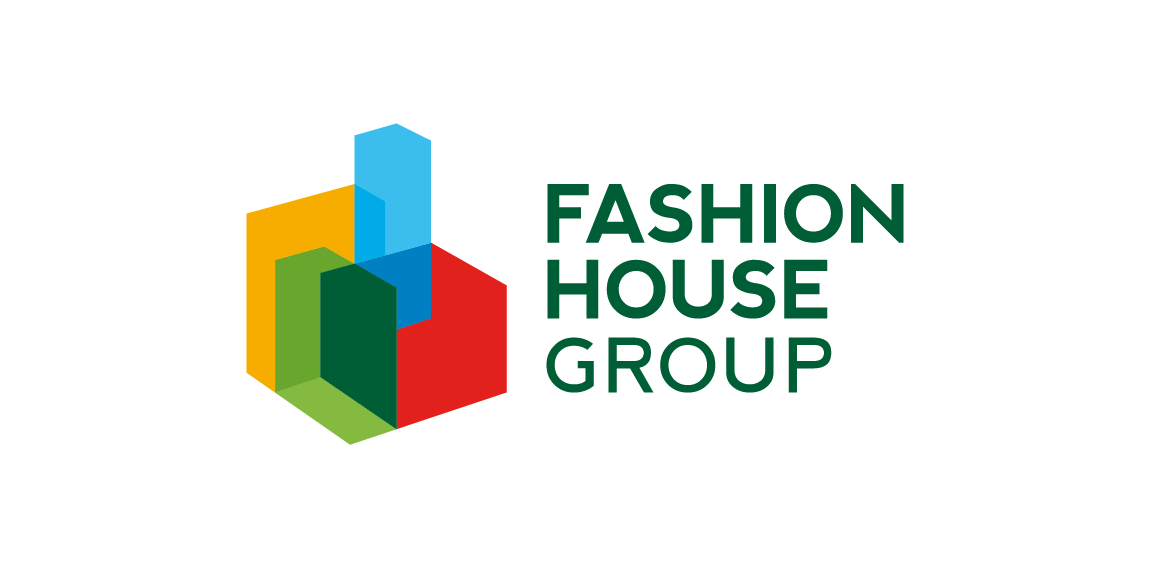
FASHION HOUSE Group is a developer and operator of fashion outlets from UK. A rebranding – the new logo was developed from a bold and surprising, albeit logical evolution of the old logomark. The abstract form of rising geometric solids invokes associations with both developer and operator activity of the Group. It references spatial dimension, development and growth. The colorful and multipart construction of the mark reflects the wide spectrum and multiple directions of FH Group’s activity. Graphic motifs derived from the mark’s structure form spectacular configurations to be used in layouts of publications and advertisements, while the colour palette allows building navigation with use of the colour code.
Logo para sistema de TV fechada. Logo for private TV system.
Neuro Dropin is an award-winning charity that supports people and families affected by a range of neurological conditions. Hotfoot created a new logo and brand identity for the charity to highlight their warm and welcoming presence in the community.

I created this design for a very well-known clothing company.

Logo design for a travel planner app. Genius + Pin
Country names, logotypes
A logo for a online different services.
Devil Note.
simple logo designs lovelive

Handwritten logo.

Logotype design for a fashion company from NYC. Made from scratch. www.dominikpacholczyk.com

My second custom typo. For my lovely girlfriend :)

logo for photo company

Logo made for Norway based hi-end clothing line. SÖLVREVEN > Silver Fox in Norwegian.

Logo design for the company "Bukdruk" dealing with short-run printing of books. Company wanted to create a symbol based on a book and a tree.
Ramotion - Icon Design and iPhone Development company.
Logo is a junction of letters S and P in a simetrical sign. The junction also stylized in a infinity symbol which presents perfection and universal solutions. The sign may be also used as loading icon, application button, linkage icon etc.

A clean, simple, straightforward logo for a flow packaging company's 2015 facelift. The simple rotation of the V symbolises the movement and process this company's machines operate with.