Highest rated logos
Highest rated logos – Page 329
This product is a height quality horse bedding produced by the nature, the Swiss forests.


Children's playroom.
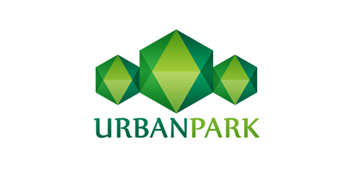
Urban Park logo concept

Exclusive Customizable Logo at Eisaks Logo Design.
Logo for an extreme sports enthusiasts community
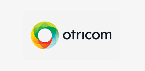
Custom logo design I did for Otricom in 2012.
Logo Design for a high-end residential contractor based in Colorado.
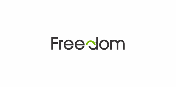
Wordmark with play on letter "d" to convey freedom
Cake Logo Design | B/W
IT Consulting Company located in Washington D.C. specializing in Virtualization, Network Design and Cyber Security

logo for vintage fashion shop
custom type
http://www.facebook.com/yaceky

A logo for a spa.

The M turned with a billow into B by motion.
VacciTech - company developing vaccines against the cancer. VT initials in pentagon shape which represent the viral vectors molecular shape.

logo for web travel service
Logo design for webpage dealing with consol games.
PR & NEW MEDIA SOLUTIONS
Logo Design for a Local Pet Care Hospital

Logo for geodetic company in Czech rep.

Jelly Jolly London is a fashion brand specializing in rain boots / clothing and accessories. Company slogan: Young / Fun / Colorful / Trendy Read the case study here: https://www.omdesign.co.uk/our-work/jelly-jolly-logo-design/

***