Highest rated logos
Highest rated logos – Page 328

logo design for a sales and lettings agent.


Traveling Salesman


A simple logo with clean lines for design services.

Children's playroom.

for fun

a logo made for my own project - custom type.

"The first mountain - the left one - is Mount Sajama, situated in Bolivia, the place of origin of the main ingredient of Bernino Gourmet Potato. The central mountain is Matterhorn, located in Switzerland, where the Rösti Potato was created along the canton of Bern. The White Rock is the last mountain and where Bernino Gourmet Potato will be launched, in Palhoça/SC, besides being a strong inspiration for the development of the first restaurant of this franchise.”

A logo for a wedding planners

Concept for a local park.
Design Art Interactive

*
This is a logo for a speech therapist center. We created a parrot ( a bird that talks fluently) and gave him the form of the letter a.

ethnic cafe

This is a logo for a Peruvian company that lets you use a land line so you can call anyone in Perú.

Internet Cafe
The vending machine company Candy Solutions required a bright, bold and playful logo to reach its consumers and to stand out from competitors. The "CS" symbol was created through an experimental process of drawing with striped toothpaste before being digitally rendered to resemble rock candy. Red and yellow were used dominantly within the design as they have been linked to the stimulation of appetite - important in the impulse purchasing of food.
Proposed logo for RYAN GLOBAL SCHOOL.

IT company

Logo for courier company.
ONE dot logo.
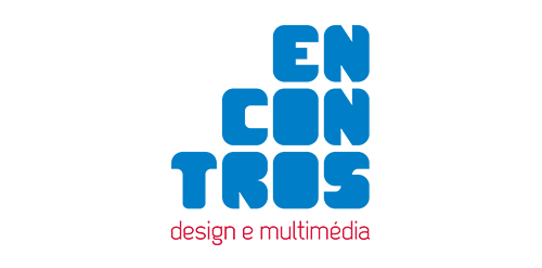
[see more in behance @ http://bit.ly/W8GJLS] Encontros Design e Multimédia is an event. It has being taken place since 2009 and consists in a week dedicated to promote and develop design and multimedia activities, workshops and meetings in the city of Braga. It's promoted by Escola Profissional de Braga. The design, organisation and communication of the event is the responsibility of a finalist student. [The brief] Encontros Design e Multimédia had a clear ambition, grow year after year, it wanted to inspire, involve and thrill the students, professionals and enthusiasts about Design and Multimedia. The logo was to be used in the website, facebook, promotional material, including posters, flyers, video, and a lot more. The goal couldn't be clearer, it had to be unusual. [The solution] The logo represents Encontros's strong ambition. It has all the elements to succeed, it's simple, relevant, it incorporates tradition, it's distinct, memorable, versatile and it stands out from the crowd. It's designed to be filled. Filled with photos, images, participants, speakers, filled with design and multimedia. It has no icons of design or multimedia and doesn't need them, it has all the qualities of both and all the creativity to be anything. [Typography] Encontros has a unique typeface, its custom and it's designed specifically for this brand. It's a bold geometric typeface designed to be filled and to get noticed in every contexts. [Colors] The colors are one of the most important elements of Encontros. The chromatic scheme is very expressive, it's a variation of the well known CMYK, providing a vast number of combinations making the brand very dynamic and inspiring as well. [see more in behance @ http://bit.ly/W8GJLS] [joserodrigues @ http://be.net/joserodrigues]

GREEN POWER is fresh modern dynamic brand with short easy memorable name. It will suite well to any business or industry.