
Highest rated logos
Highest rated logos · Page 325

Logo proposal for an App development company. Wax seal is used to represent their expertness and various colors suggests various services they provide.


From a Collection of Ready Made Logos by Ingus Eisaks.
Marketing agency. Selected proposal. It turned out that the most important thing for the client was the impression of experience, seriousness, stability and ability to take on the most demanding jobs. Custom made lettering was a big part of why they have decided to go with this design.

Logo for a restaurant that serves only healthy food.

Just a thought

Redesign

A 'nexus' of dots and lines form a leaf.

My new personal logo

...
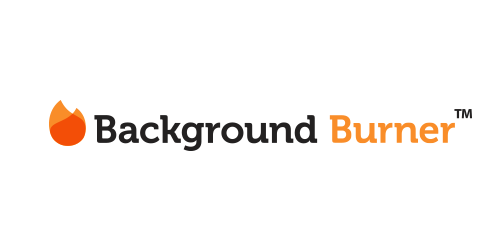
The Background Burner quickly removes the background from any image or photo.
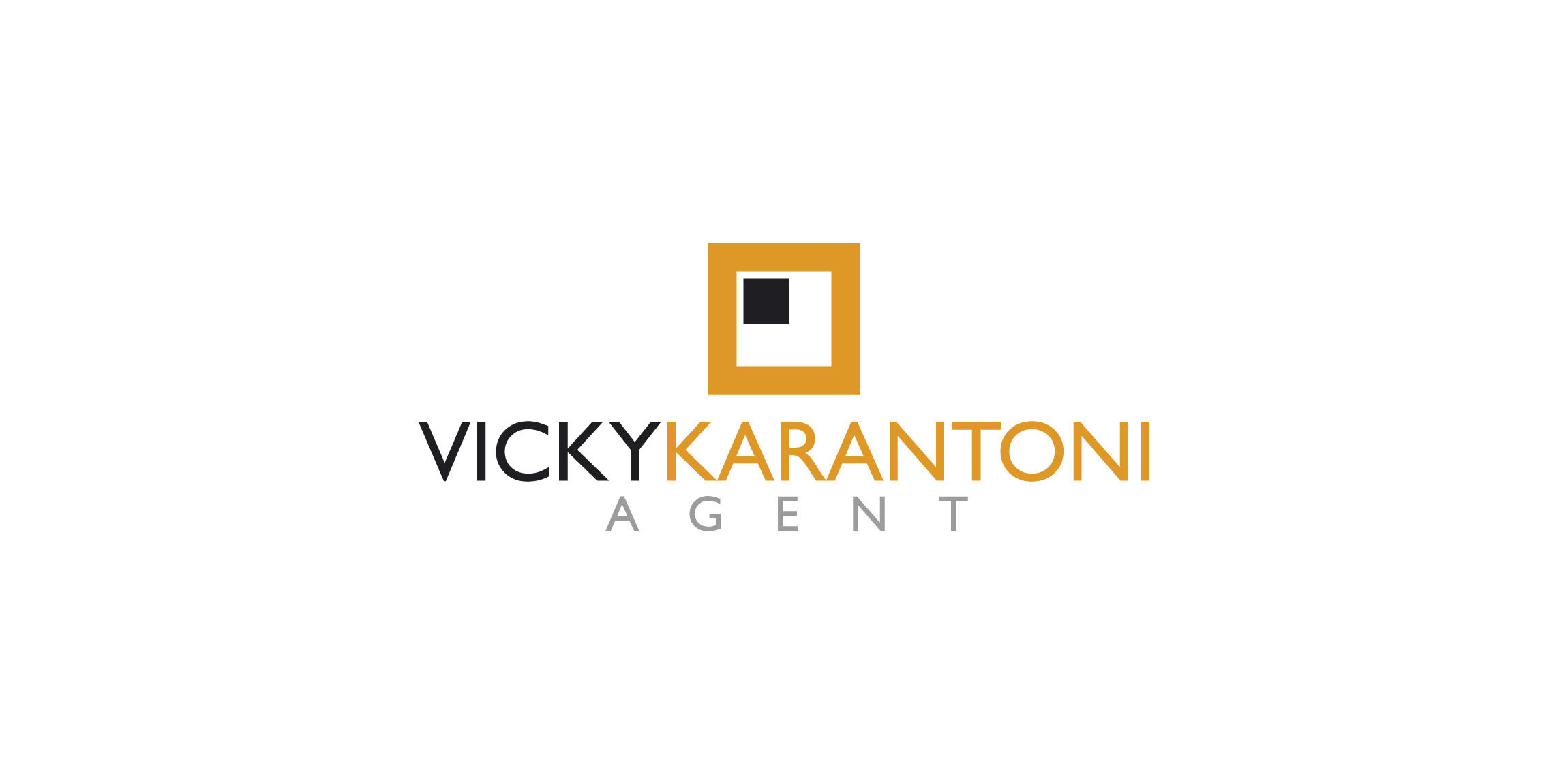
This logo was designed for Vicky Karantoni agent

The concept of this logo is a bit traditional as the elements are aligned to the central axis to provide stability to the Visual Identity. We iconized the product in order to avoid any language barriers between the brand and any potential customer.

The Oriental Pearl resort at Mui Ne,Phan Thiet, Vietnam
Logo Fusteria Ordesa


About the logo Status: Logo: DETSKE WORKSHOPY Brand/Logo Name: Detske Workshopy Logo Designer: Tomas Novotny Tools: Adobe Illustrator CC Year: 2014 __ © Raven Studio // ravenstudio.cz
Logo for PROFESSIONALS who have a HIGH IQ and/or live with ADHD.

Logo for the 30th anniversary of the Asamblea Nacional de Nicaragua.

Bicycle rental service for passengers of the Beauvais airport and its employees, or city inhabitants willing to enjoy a fun ride, Aerobike is an innovative service that launched in summer 2010. Brand Brothers created a complite brand identity with a dynamic and fun spirit. With a special typography created for the occasion, an easily identified sign and a strong and colorful graphic, Aerobike is now noticeable in the surrounding landscape!
Brand of tailor made suits.

Imkerei Wojciechowski is an apiary from Austria. This contemporary geometric linear logo for an apiary reinterprets in a fresh way symbols common in the apiculture trade. The image of a bee emerges out of intersecting hexagons of a honeycomb. It creates a layout, whose aesthetic strength lies in the logic of construction. The logomark is complemented by the brand name written using an original angular typeface.