Highest rated logos
Highest rated logos – Page 32

Intricate and delicate gold leaf logo design. For sale.


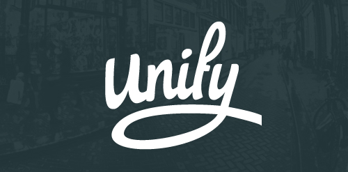
The new identity of Unify, which is a graphic design and development studio based in the Netherlands. The aim of the logo was to make it personal and strong, a logo which really stand out!
http://dribbble.com/shots/1386788-Unify-Logotype

Logo designed for a new company, an academic service provider.
Hekademia is an archaic Greek name for the land that contained a sacred grove of olive trees dedicated to Athena, goddess of wisdom. It is the place in which Plato built his school of philosophy. The logo needed to reflect this theme and include an olive or olive tree reference.

Only a first draft for a company logo.

Sunny Wines is a small wine importer from Warsaw/Poland. The aim was to combine letters SW with wine symbols like grapes or cork screw, but the client wanted to see also more elegant symbol combining those letters.

http://www.facebook.com/yaceky

Bulgarian hard techno project

Unused proposal for vintage women clothing.
KOBALT pracownia projektowa
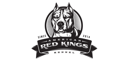
American Red Kings - They are breeders of American Staffordshire Terrier – (Amstaff) breed; sell puppies to Brazil and export to other countries. They also provide advice on breeding and animal behavior and expose their dogs at exhibitions.

Radio

Brand Brothers created the visual identity and branding of this young delivery company with one goal: make it attractive and promote a business whose communication is often neglected by creating a recognizable brand with a strong visual, playing with the main transportation codes.
Logo designed for an artificial grass company
Logo for photographer.

Logo represents two swans forming a heart shape. In the background is the lotus flower is a symbol of purity.

Lost and Found website

A nice and unique logo featuring a bull's head created in a tattoo style in some nice color combination of blue, red, orange and yellow.

Fund management company based in Dubai, focused on exotic emerging markets: Middle East, Africa and Central Asia.
"Jadara" is an Arabic word meaning: merit, competence, worthiness, leadership. We have tried out a lot of ideas, but finally we settled on the symbol of an olive tree, suggested by the client. It conveys most important Jadara values - strength, determination, wisdom, stability and sustained growth. The symbol has been matched with lettering that subtly reminds Arabic typography.
keywords: olive tree, middle east, responsibility

https://www.behance.net/gallery/14618723/Flappers-Learn-To-Fly Proyecto comercial - Flappers ▲ Learn to Fly “Las FLAPPERS fueron aquellas mujeres pioneras en el siglo XX. El término quería decir algo así como “aladas”, traducido podía entenderse como alegría, vivacidad, persona inconstante, que va de flor en flor”

Dental Lab

Just for fun! Happy early Halloween, fellas! :)
Chamelion- HD Experiments

A mark that created from combination of 'Mount Kilimanjaro' and 'coffee bean' shapes.

MYRMIDON is brand focus about Investment. the Logo inspired from Shield, Helmet spartan and M