Highest rated logos
Highest rated logos – Page 314


Custom logo design I did for Otricom in 2012.

Micetake

Fun little design to play up a company that can carry the big stuff with ease and security. Copyright Mike Bruner-5-2012

Logo design for power grid company.

A 'nexus' of dots and lines form a leaf.
Logo for my art & design studio.
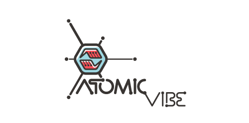
I define ATOMICvibe as the "a-HA!" moment of clarity in the creative process. Like nuclear fusion, it's when tiny ideas coalesce, and then explode into beautiful design.
The logo visually depicts this creative reaction. Forming abstract A & V shapes, the converging hands cradle the tiny beginnings of a big idea, fusing them until they discharge a shockwave of creativity. The custom type, designed to perfectly integrate with the mark, is meant to symbolize electron paths. Heavily inspired by retro imagery from the Atomic Age: science, the Space Race, Sputnik, the iconic George Nelson Ball Clock.
Click here to see the case study for this logo, which chronicles its development, and includes full design rationale, sketches, electronic roughs, and alternate designs.
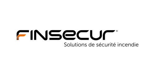
Finsecur is a manufacturer and a French leader in fire detection systems. With competitors like Siemens or Tyco and clients such as M6 or Air France, the company needed to acquire an image to match its ambitions. Brand Brothers has been working since January 2010 to develop the new global visual identity and branding of Finsecur.
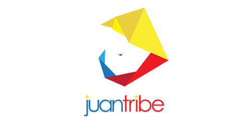
Logo for Juan Tribe - inspired by origami / paper folds - the logo makes use of the Philippine colors - the logo resembles "Juan Tamad" who is a character in a famous Philippine folklore noteworthy for extreme laziness.