Highest rated logos
Highest rated logos – Page 31

BATRONOX is fresh modern dynamic brand with short easy memorable name. It will suite well to any business or industry


Unused logo for a sushi bar. I created two cute asian girls for this project, but it turned out I had chosen an inappropriate direction.
Logo for my friend's business.
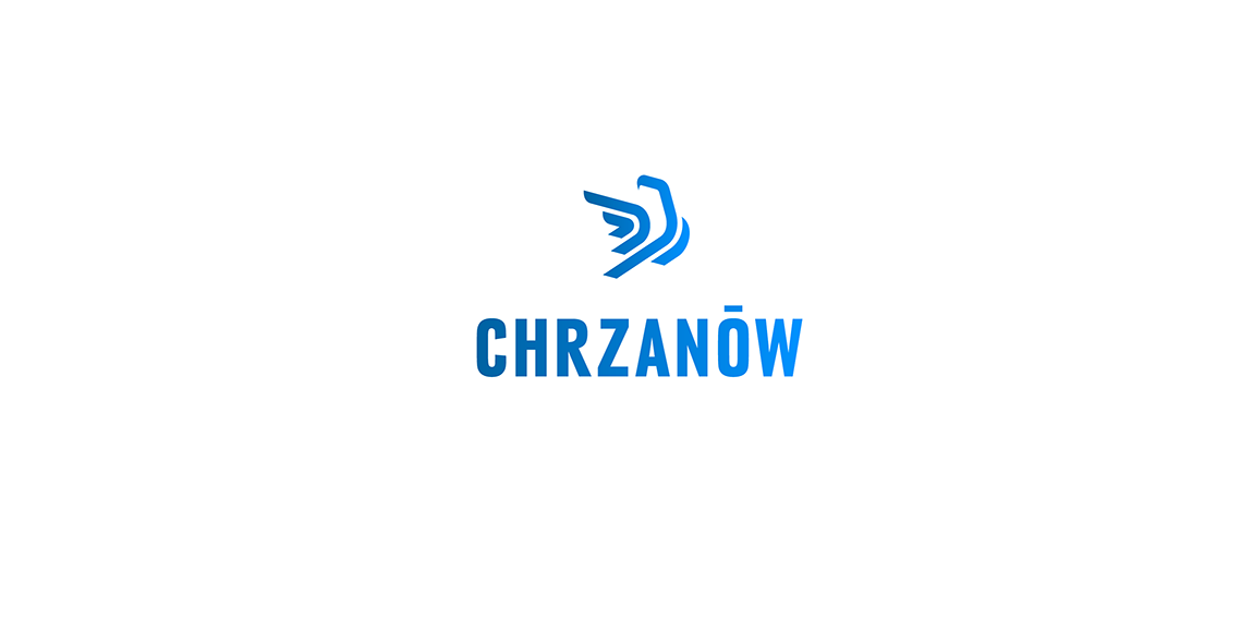
Logo proposal for a town named Chrzanow. The sign is a simplified presentation of an eagle which is most recognizable sculpture on the main square in the town.
Just playin with ideas – fishee

Logo for real estate

Eco Art

Tres Magos is Spanish for the Three Wise Men / Kings / Magi The name, referencing the distinguished foreigners who visited Jesus after his birth, bearing gifts, was meant to represent a producer of smart furniture for children, designed according to the Montessori education method. The logomark portrays both the Magi – as three coloured silhouettes or wizard hats, as well as Kings – in the form of a crown, which symbolises also the highest quality of products. The pleasent colours, rounded corners and use of basic shapes, signals the childrens theme.

A logo for a premium domain reseller - fast project.

Concrete floor.
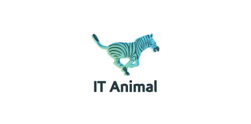
Logo called "IT animal" captures a moment of running zebra. Logo has exceptional color palette.
Town of taste in russian.

Initials logo for Department of Bulgarian Academy of Sciences. (D formed by connected C and L letters).
Some experiment about verbicon, i hope you like :)

Another logo for a short-run of caps, t-shirts, etc.

AMARCAT is fresh modern dynamic brand with short easy memorable name. It will suite well to any business or industry.
Phelan McDermid Syndrome Foundation
Sai Coats paints


Logo design for a travel planner app. Genius + Pin
Detailed information on food and recipe
Logo for our up and coming shirts/prints/design shop. Crazy excited, we launch in January so keep a look out www.loudlion.us

naming and logo created for a professional graphic design studio based in mexico.

Logo for barber "Elegant"