Highest rated logos
Highest rated logos – Page 282
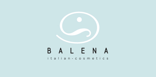
Balena italian cosmetics


One of the logo proposals for the manufacturer of testers for the breast cancer early detection.

Logo for advertising agency.

Logo design featuring a cute nerd skull character. The skull face is wearing a pair of large nerdy eye glasses and wearing a bone bow tie. Simple colorful shapes float above the skull head representing gaming controls and buttons. https://www.logomood.com/downloads/nerd-skull/

logo created for a wine store based in mexico.
Abstract bird in the shape of a swan with increasing financial bars

"CSR w wielkim formacie" in english mean "CSR in large format". It is a Corporate Social Responsibility program started by Opinion company (large printhouse). - - - An elephant is a symbol of big/large (format), intelligent/wisdom (responsibility) in multicolor squares form as a symbol of print. - - - As seen on www.csropinion.pl

Monogram

Numerissimo is a company located in Paris specialized in scanning, archiving and editing technologies, with a strong innovative and creative potential. Brand Brothers designed the graphic identity and branding, with a logotype that reminds technicality and graphic works in a simple, pure and creative spirit.

Logo design for “Gewoon! Wijn & Bier” (translated: Just! Wine & Beer), a Dutch café. It got us a lot of free drinks...
Monogram made for fun. In case of interest it is for sale.

Simple logo for a local alterations and dry cleaning business.

HARPY is fresh modern dynamic brand with short easy memorable name. It will suite well to any business or industry.

Advertising agency "Fominova" Almaty, Kazakhstan
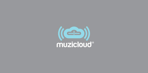
Muzi(c)loud - this is the perfect & clean brand for a streaming radio service.

Human Rights A flower a symbol of life, built with people. Multi-ethnic and multi-colored logo. :::::::::: File variations :::::::::: http://applexlogos.blogspot.com/2011/11/un-logo-per-i-diritti-umani.html

Logo Petits Pas. Firm for kids shoes
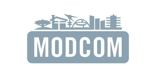
Los Angeles Conservancy's Modern Committee (Modcom) preserves modern architecture in Los Angeles
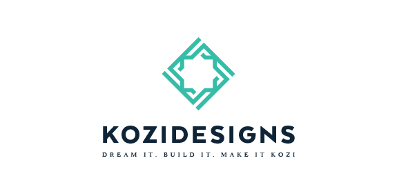
kozidesigns - Branding proposal, check full project https://www.behance.net/gallery/45544023/Kozidesigns-Branding-Proposal
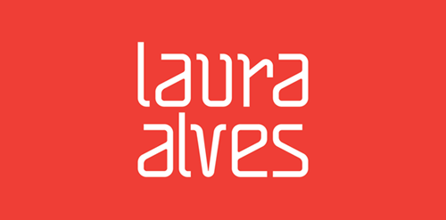
"The project for Architect and Urban Planner Laura Alves was based on the abstract forms and drafts used on a daily basis of the architect. We used orange as a color base because it inspires creativity."

Vicco Children's Shoes


branding for network logo for anyone gathering around the art and gardens
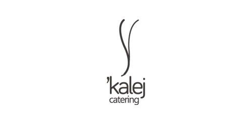
logo for a catering services company based in mexico.